
Area Multi Line Chart
The area multi line chart compares different data areas to clearly display data changes.
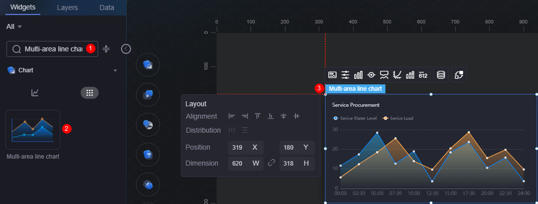
On the large screen design page, drag the area multi line chart widget from All > Chart to the blank area of the canvas, as shown in Figure 1.

Card
A card wraps a chart widget. A widget consists of card elements (card title, chart, card background, and card border) and chart elements.
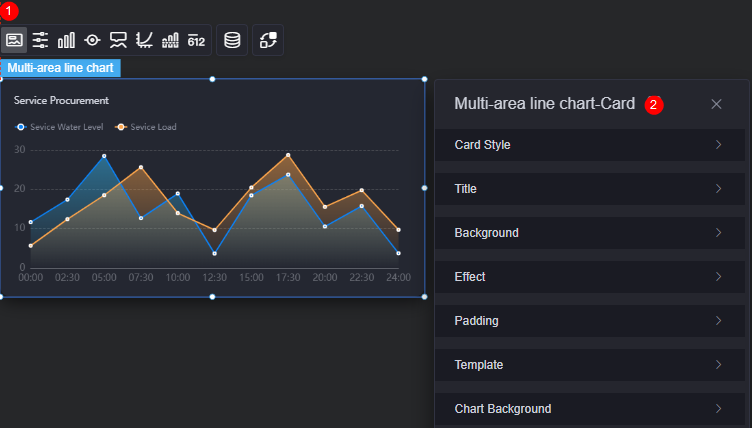
- Card style: You can select a card style based on your service requirements. You can click the clear style button to clear the configured style.
- Title
- Title: Whether to display the widget title.
- Content: Widget title.
- Font: Font, size, and color of the widget title.
- Align: Alignment mode of the title relative to the widget.
- Title background color: Background color of the title.
- Padding: Distance between the title and the four sides of the widget box, in pixels by default.
Figure 4 Padding

- Title margin bottom: Distance between the widget title and the area multi line chart.
Figure 5 Title offset

- Background
- Background color: Background color of the widget card.
- Border: Border of the widget card. Options: no border, full border, and corner border. For full border and corner border, you can set the line type and rounded corners of the outer border of the widget.
- Style: Image display style. The options are normal, center, stretch, and tiled.
- Choose image: Use a local image as the widget background. Directories and subdirectories can be added to facilitate image management by category. JPG, JPEG, PNG, and GIF images are recommended. Each image cannot exceed 50 MB.
- Special effect: Widget highlighted status. Displayed by default or on page load.
- Padding: Distance between the chart and the four sides (top, bottom, left, and right) of the widget (see Figure 2). The default value is 0, indicating that the chart spreads across the widget.
- Reference template: Preset widget templates, which can be default or marked.
- Chart background: Background color, rounded corners, and inner padding of the chart.
Configuration
In the configuration, you can enable or disable the swiper effect of the widget.
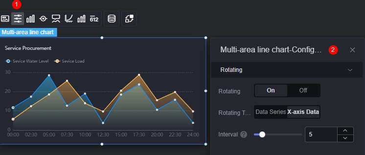
- Swiper: Whether to enable the swiper effect.
- Swiper type: Swiper type of the chart, which can be data series and x-axis data.
Figure 7 Area multi line chart data series swiper effect
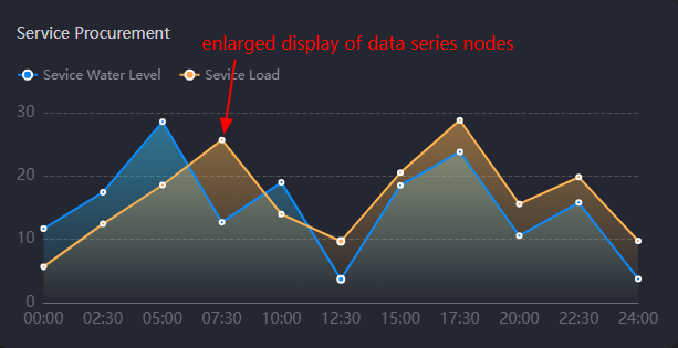 Figure 8 Area multi line chart x-axis swiper effect
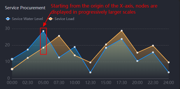
- Interval: Swiper interval of the chart. The value cannot be greater than 24 seconds.
Graphic
A graphic is a specific graphical expression element that visualizes data in a widget, for example, a slice in a pie chart, a bar in a bar chart, a line or a kink point in a line chart.
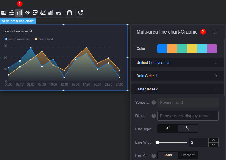
- Color: Color of the chart graphic in the widget.
- Unified configuration
- Line type: Line type of the chart. The options include smooth and unsmooth.
- Line width: Line width in the chart.
- Kinking point size: Size of kink points.
- Data label: Whether to display data labels. If they are displayed, you can set their color.
- Data label (max, min, avg): maximum, minimum, and average values of data labels.
- Data Series
- Series name: Default series name in the raw data. You can change the series name by configuring the display name.
- Display name: Display name of the series in the chart.
- Line type: Line type of the chart. The options include smooth and unsmooth.
- Line width: Line width in the chart.
- Line color: Pure or gradient. If the reference line is enabled, the gradient changes with the reference line value.
- Polyline opacity: Opacity of polylines.
- Kinking point size: Size of kink points.
- Kinking point color: Color of kink points.
- Point opacity: Opacity of kink points.
- Area color: Color of the areas in the line chart.
- Data label: Whether to display data labels. If data labels are displayed, you can set their color, prefix, and suffix.
- Data label (max, min, avg): maximum, minimum, and average values of data labels.
Legend
A legend shows the dimensions in a multi-dimensional visualized graphic expression.
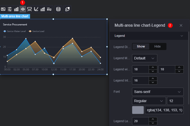
- Legend display: Whether to display the legend. The legend text content comes from the value of s in the data model.
- Legend marker: Shape of legend icons.
- Legend width and height: Width and height of legends.
- Legend interval: Space between legends.
- Font: Font, color, and size of legends. The legend text content comes from the value of s in the data model.
- Legend left margin: Distance from the legend to the left of the area multi line widget.
- Legend top margin: Distance from the legend to the top of the area multi line widget.
- Page up button: Color of the page up button.
- Inactivate page turning button: Color of the page up button when it is not activated.
- Custom legend setting: After this function is enabled, you can adjust the display length of the legend name. By default, Off is selected, indicating that the entire legend name is displayed.
Tooltip
Tooltip (floating prompt) displays metrics of specific dimension nodes in a visualized chart widget.
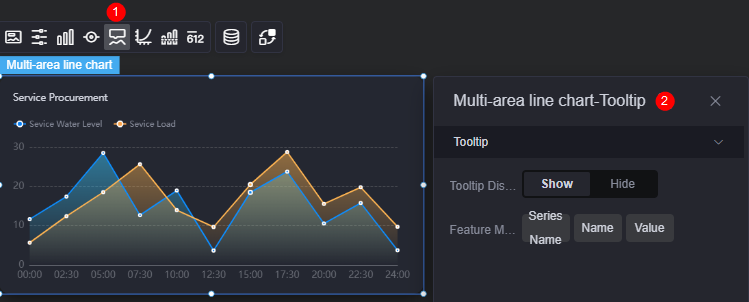
- Tooltip display: After this function is enabled, the information is displayed when you place the cursor on a specific series during chart preview.
- Feature marker: Content format of the tooltip box, such as series name, data name, data value, and percentage.
Coordinate
You can set the style, color, position, and behavior of the coordinate system for a chart widget.
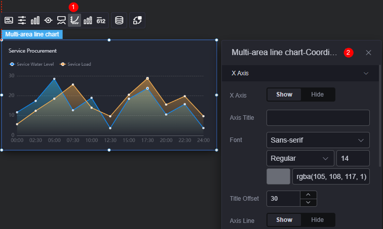
- X axis
- X axis: Whether to display the X axis.
- Axis title: Title of the X axis.
- Font: Font, color, and size of the axis.
- Title offset: Offset of the title relative to the axis.
- Axis line: Whether to display the axis line. If the axis line is displayed, you can set its color.
- Axis tick: Whether to display the scale.
- Scale label: Scale label style, which can be automatic adjust label and all tags.
- Scale label font: Font, font color, and font size of the scale label.
- Label behavior: How to process a label that contains too many characters. The options include wrap up, omit, and ignore.
- Number of characters in a single line: Number of characters displayed in a single line. This parameter is required only when the label behavior is set to Wrap or Omit.
- Label rotate: Rotation angle of labels.
- Grid line: Whether to display grid lines.
- Y axis
- Y axis: Whether to display the Y axis.
- Axis title: Title of the Y axis.
- Font: Font, color, and size of the axis.
- Title offset: Offset of the title relative to the axis.
- Axis line: Whether to display the axis line. If the axis line is displayed, you can set its color.
- Axis tick: Whether to display the scale.
- Scale label font: Font, font color, and font size of the scale label.
- Minimum interval: Minimum interval between coordinates.
- Label behavior: How to process a label that contains too many characters. The options include wrap up, omit, and ignore.
- Number of words in a single line: Number of characters displayed in a single line. This parameter is required only when the label behavior is set to "Too Many Characters" or "Too Many Characters".
- Grid line: Whether to display grid lines.
- Axis start value: Start value of the Y axis. To facilitate data display, when the input value is the maximum value of the ingested data, the start value of the Y axis in the chart is half of the maximum value.
- Left Y axis unit: Unit of the left Y axis.
- Label show: Display style of Y axis labels, for example, "Default" or "Count Units".
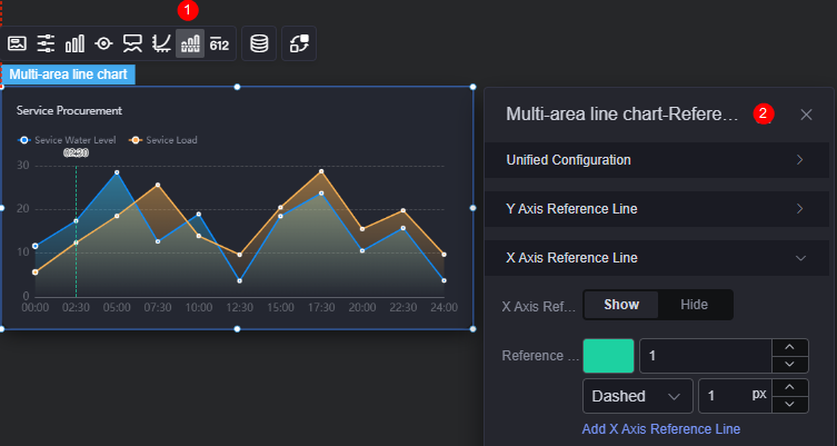
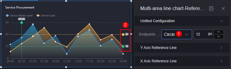
Reference Line
Reference lines are a visualized standard added to a chart widget to provide data reference.
- Unified configuration: Style of the two ends of the reference line, such as circle, rectangle, and triangle.
Figure 14 Y axis reference line start and end style
- Y axis reference line
- Y axis reference line: Whether to display the Y axis reference line.
- Reference line: Color and type of an existing reference line. To add a reference line, click Add Y Axis Reference Line. To delete a reference line, click x next to it.
- X axis reference line
- X axis reference line: Whether to display the X axis reference line.
- Reference line: Color and type of an existing reference line. To add a reference line, click Add X Axis Reference Line. To delete a reference line, click x next to it.
Metrics
Metrics supplement to all aspects except the visualized chart in a widget by using text and numbers, providing value reference for the widget.
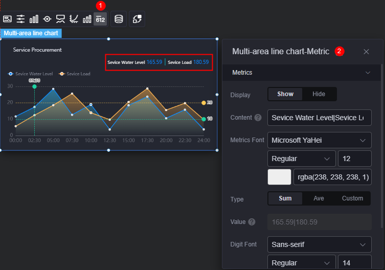
- Metrics display: Whether to display metrics.
- Metrics content: Content of metrics.
- Metrics font: Font, size, and color of the metric content.
- Metrics value type: Metric type, which can be sum, average, or custom.
- Metrics value: Set the value if the metrics value type is custom.
- Number font: Font, size, and color of the data.
- Metrics digit places: Number of digits after the decimal point.
Data
In the data settings, you can set the data source of a widget. For more information, see Data Access.
Interaction
In the interaction settings, you can configure interactions between this widget and other widgets or pages. For details, see Interaction Configuration.
Feedback
Was this page helpful?
Provide feedbackThank you very much for your feedback. We will continue working to improve the documentation.See the reply and handling status in My Cloud VOC.
For any further questions, feel free to contact us through the chatbot.
Chatbot


