
Basic Pie Chart
A basic pie chart is the most basic form of pie charts. It displays data clearly on visualized applications.
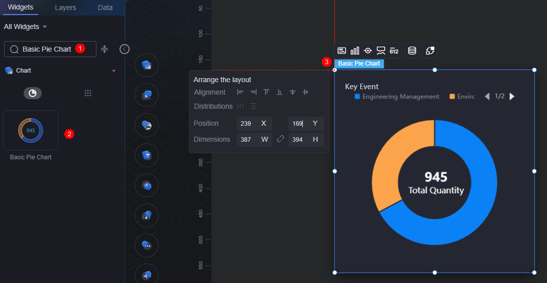
On the large screen design page, drag the basic pie chart widget from All > Chart to the blank area of the canvas, as shown in Figure 1.

Card
A card wraps a chart widget. A widget consists of card elements (card title, chart, card background, and card border) and chart elements.
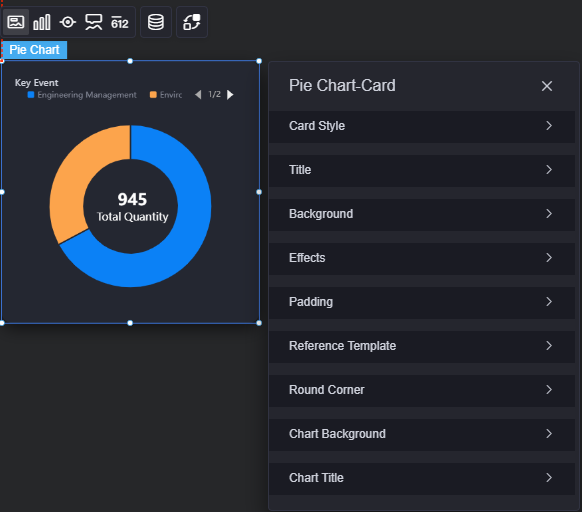
- Card style: You can select a card style based on your service requirements. You can click the clear style button to clear the configured style.
- Title: Whether to display the widget title (for example, "Key Event" in Figure 3). If you set it to display, you can customize the following attributes of the title:
- Content: Text displayed in the widget title.
- Font: Font style, size, and color of the widget title.
- Alignment: Alignment mode of the title relative to the widget, such as left alignment, center alignment, and right alignment.
- Background color: Background color of the title.
- Padding: Distance between the title and the four sides of the widget box, in pixels.
Figure 4 Padding

- Title offset: Distance between the widget title and the pie chart.
Figure 5 Title offset

- Total quantity title: Text under total quantity.
- Background
- Background color: Background color of the widget card.
- Border: Border of the widget card. Options: no border, full border, and corner border. For full border and corner border, you can set the line type and rounded corners of the outer border of the widget.
- Style: Image display style. The options are normal, center, stretch, and tiled.
- Choose image: Use a local image as the widget background. Directories and subdirectories can be added to facilitate image management by category. JPG, JPEG, PNG, and GIF images are recommended. The image size cannot exceed 50 MB.
- Special effect: Widget highlighted status. Displayed by default or on page load.
- Padding: Distance between the chart and the four sides (top, bottom, left, and right) of the widget (see Figure 2). The default value is 0, indicating that the chart spreads across the widget.
- Reference template: Chart template, which can be default or labeled.
- Round corner: Round corners of the border. The radian of the four corners ranges from 0 to 500, in pixels.
- Chart background: Background color of the chart.
- Chart title: Whether to display the chart title. If you set it to display, you can customize the title content, font, size, and color.
Graphic
A graphic is a specific graphical expression element that visualizes data in a widget. For example, a graphic can be a slice in a pie chart, a bar in a bar chart, or a line or an inflection point in a line chart.
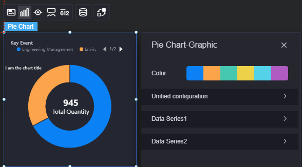
- Color: Color of the graphic.
- Unified configuration: Applies to all data series in the chart.
- Data series: Whether to display data series in a chart.
- Nightingale rose chart: Whether to use the Nightingale rose chart.
- Inner radius (%): Inner radius of the pie chart.
- Outer radius (%): Outer radius of the pie chart.
- Horizontal coordinate of the circle center (%): Horizontal coordinate of the circle center of the pie chart.
- Vertical coordinate of the circle center (%): Vertical coordinate of the circle center of the pie chart.
- Arrangement sequence: Slices can be arranged clockwise or anticlockwise.
- Start angle: Start angle of a slice.
- Minimum angle: Minimum angle of a slice.
- Hover effects: Whether a slice stands out on hover.
- All label settings: Whether to display labels in the chart.
- All label hover settings: Whether to display labels when you hover the cursor over a specific data series.
- Label position: inside, outside, or in the middle.
- Display visual guide line: Whether to add a guide line in front of a label.
- Guide line length: Length of the label lead line.
- Label content: Content displayed on the label, including the data value, percentage, and series name.
- Label text: Font, size, and color of the label content.
- Stroke: Stroke style of the pie chart series and the overall chart.
- Background: Background color, inner radius, and outer radius of the pie chart.
- Data Series
- Series name: Default series name in the raw data. You can change the series name by configuring the display name.
- Display name: The actual series name displayed in the chart.
- Subscript: Location of the data series.
- Initially selected: Whether a data item is initially selected.
- Color style: Color style of the data series. The following color styles are supported:
- Monochrome: Normal colors and highlighted colors are available.
- Gradient color: You can set gradient style, gradient direction, start color, and end color.
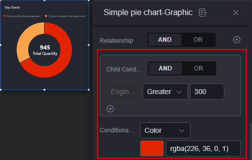
- Condition color: Add the condition format to set the condition and response data column style.
Figure 7 Setting the condition style
- Texture: You can upload a texture image to customize the color format of the data series.
- Common label: Label when no data series is selected.
- Display series name: Whether to display a series name in a label, for example, "Engineering Management".
- Display data value: Whether to display a data value in a label, for example, the data value 635 corresponding to engineering management.
- Whether to display the percentage: Whether to display the percentage in a label. For example, the percentage corresponding to engineering management is 67.2%.
- Common label font: Font, color, and size of labels.
- Highlight label: Label when a data series is selected.
- Display series name: Whether to display a series name in a label, for example, "Engineering Management".
- Display data value: Whether to display a data value in a label, for example, the data value 635 corresponding to engineering management.
- Whether to display the percentage: Whether to display the percentage in a label. For example, the percentage corresponding to engineering management is 67.2%.
- Highlight label font: Font, color, and size of labels.
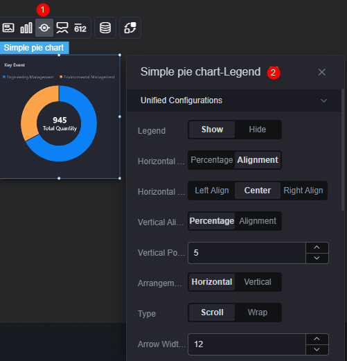
Legend
A legend shows the dimensions in a multi-dimensional visualized graphic expression.
- Unified configuration
- Legend: Whether to display legends, such as "Engineering Management" and "Environment Management". The legend text content comes from the value of s in the data model.
- Horizontal alignment: Horizontal alignment mode of the legend, which can be left, center, right, and by percentage.
- Vertical alignment: Vertical alignment mode of the legend, which can be top, center, bottom, and by percentage.
- Arrangement direction: Arrangement direction of the legend, which can be horizontal and vertical.
- Type: There are many legends. As a result, not all legends can be displayed in the chart. In this case, you can set the legend type, that is, whether to view legends by scrolling pages or by line break. If this parameter is set to "Scroll", you can set the width and height of the page turning arrow, default icon color, icon selection color, and page number front.
Figure 9 Scroll effect
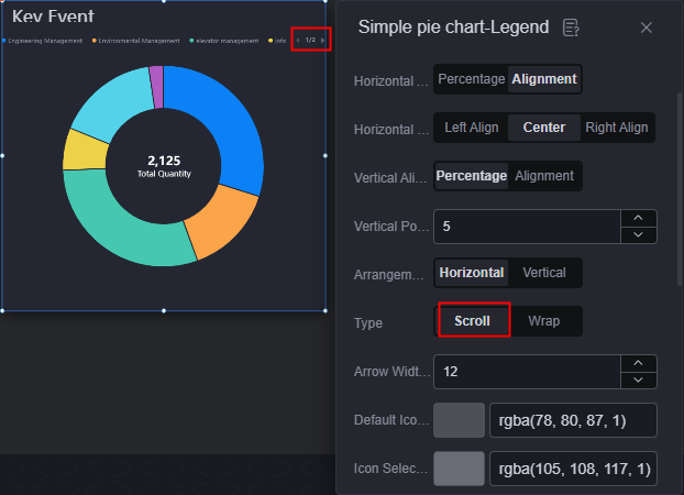 Figure 10 Line break effect
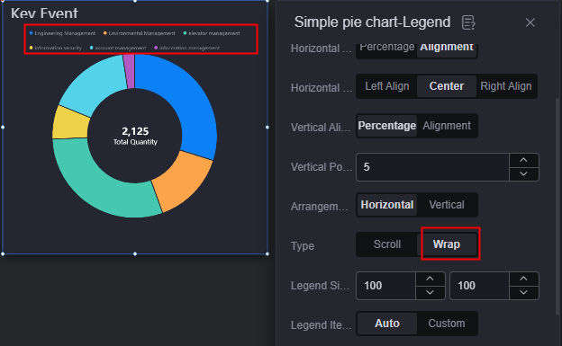
- Legend item width: Set the width of the legend. The width can be automatically set or customized.
- Legend spacing: Space between legends.
- Legend marks
- Legend marks: Shape of the icon before the legend.
- Mark width and height: Width and height of the icon before the legend.
- Legend series name
- Font: Font, color, and size of legends.
- Legend character: Number of characters displayed in the legend. You can select full display or ellipsis. If this parameter is set to "Ellipsis", you can set the number of characters displayed in the legend.
- Data value: Whether to display number in the legend. If this parameter is set to "Show", you can set the following parameters.
- Font: Font, size, and color of the number in the legend.
- Value left spacing: Space between the series name and data.
- Prefix: Whether to display the prefix before the number.
- Prefix content: Set the prefix content to be displayed.
- Prefix font: Font, size, and color of the prefix.
- Prefix right spacing: Space between the prefix and the number.
- Suffix: Whether to display the suffix after the number.
- Suffix content: Set the suffix content to be displayed.
- Suffix font: Font, size, and color of the suffix.
- Suffix left spacing: Space between the suffix and the number.
- Percentage: Whether to display the percentage. If this parameter is set to "Show", you can set the following parameters.
- Digital font: Font, size, and color of the number in the percentage.
- Percent font: Font, size, and color of the % in the percentage.
- Percent left spacing: Space between the number and percentage.
Tooltip
Tooltip (floating prompt) displays metrics of specific dimension nodes in a visualized chart widget.
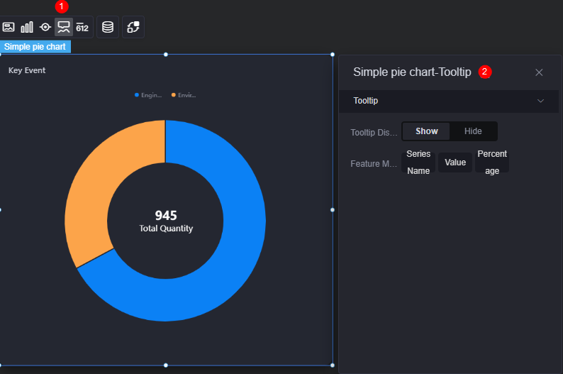
- Tooltip display: After this function is enabled, the information is displayed when you place the cursor on a specific series during chart preview.
- Feature marker: Content in the tooltip box, such as series name, data value, and percentage. Only one or two of them can be displayed.
Metrics
Metrics provide supplementary text and number information to a graphic in a widget.
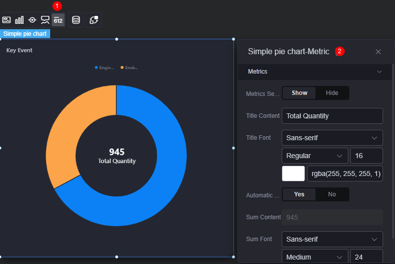
- Display metrics: Whether to display metrics in the chart.
- Title content: The text content of a user-defined metric.
- Title font: Font, size, and color of the metric title.
- Automatic sum: Whether to automatically sum up metric values.
- Value content: If automatic sum is disabled, you can customize the metric value. If automatic sum is enabled, the value is the sum of the engineering management value and environment management value.
- Sum font: Font, size, and color of the metric value.
Data
In the data settings, you can set the data source of the pie chart widget. For more information, see Data Access.
Interaction
In the interaction settings, you can configure the interaction between the pie chart and other widgets or pages. For details, see Interaction Configuration.
Feedback
Was this page helpful?
Provide feedbackThank you very much for your feedback. We will continue working to improve the documentation.See the reply and handling status in My Cloud VOC.
For any further questions, feel free to contact us through the chatbot.
Chatbot


