Creating Multi-Device Compatible Advanced Pages
Expected Results
How is the same page displayed on devices of different sizes? Huawei Cloud Astro Zero provides two types of device views: PC view and mobile view. The liquid layout is responsive. Huawei Cloud Astro Zero also provides the stretch function for the absolute layout to assist adaptation. To ensure that custom widgets can adapt to devices with different resolutions, comply with responsive layout design specifications. Responsive design of widgets is the foundation of multi-device adaption. This practice shows how to develop an item list widget that meets these requirements.
The product list widget can be used on web and mobile devices with different resolutions. The product layout in the widget can be automatically adjusted based on the screen or browser window size.
Implementation Methods
- Download a widget template.
- On the Huawei Cloud Astro Zero console, click Access Homepage to go to the application development page.
- Click
 and choose Environments > Environment Configuration.
 - Choose Maintenance from the main menu.
- In the navigation pane, choose Global Elements > Page Assets > Widget Templates.
- In the widget template list, click widgetVueTemplate. The template details page is displayed.
- Click Download, set the widget name to commodityListWidget, and click Save. If you select Download original template, the widget name in the downloaded widget package will not be changed.Figure 1 Saving a template

- Decompress the downloaded template package and create an img folder to store 10 product images with a resolution of 380 x 440, as shown in Figure 2.
- Create a Commodity object in commodityListWidget.js and assign a value.The Commodity object contains three attributes: src (product image path), title (product title), and content (product description).
var vm = new Vue({ el: $("#widgetVueTemplate",elem)[0], data:{ Commodity: [ { src: widgetBasePath+"img/mate40.PNG", title: "HUAWEI Mate 40", content: "HUAWEI Mate 40 5G full-frequency 8 GB+128 GB (black)" }, { src: widgetBasePath+"img/mate40White.PNG", title: "HUAWEI Mate 40", content: "HUAWEI Mate 40 5G full-frequency 8 GB+128 GB (white)" }, { src: widgetBasePath+"img/mate40pro.PNG", title: "HUAWEI Mate 40 Pro", content: "HUAWEI Mate 40 Pro full-frequency 8 GB+128 GB (black)" }, { src: widgetBasePath+"img/mate40proWhite.PNG", title: "HUAWEI Mate 40 Pro", content: "HUAWEI Mate 40 Pro full-frequency 8 GB+256 GB (mystic silver)" }, { src: widgetBasePath+"img/mateXs.PNG", title: "HUAWEI Mate Xs", content: "HUAWEI Mate Xs 5G full-frequency 8 GB+512 GB (interstellar blue)" }, { src: widgetBasePath+"img/mate30Epro.PNG", title: "HUAWEI Mate 30E Pro", content: "HUAWEI Mate 30E Pro full-frequency 8 GB+128 GB (space silver)" }, { src: widgetBasePath+"img/p40pro.PNG", title: "HUAWEI P40 Pro", content: "HUAWEI P40 Pro 5G full-frequency 8 GB+256 GB (ice white)" }, { src: widgetBasePath+"img/nova8Black.PNG", title: "HUAWEI nova 8", content: "HUAWEI nova 8 8 GB+128 GB full-frequency edition (black)" }, { src: widgetBasePath+"img/nova8Provence.PNG", title: "HUAWEI nova 8", content: "HUAWEI nova 8 8GB+128GB full-frequency edition (blush gold)" }, { src: widgetBasePath+"img/nova7Purple.PNG", title: "HUAWEI nova 7", content: "HUAWEI nova 7 8GB+128GB full-frequency edition (midsummer purple)" } ] } }); - Set the rendering page in commodityListWidget.ftl, traverse the Commodity object, and display the product images, titles, and descriptions in the widget.
<div id="widgetVueTemplate" style="margin: 20px;"> <section id="boxes"> <div class="container"> <div class="box" v-for="obj in Commodity"> <img :src="obj.src"> <h3>{{obj.title}}</h3> <p>{{obj.content}}</p> </div> </div> </section> </div> - Define the widget style in commodityListWidget.css.The percentage is used to adjust the width of a single product, a breakpoint is set, and the @media query is applied to modify the product display width percentage for different view area widths.
/*Set the font, inner margin, outer margin, and background color of the widget.*/ #widgetVueTemplate{ font:15px/1.5 Arial, Helvetica, 'Microsoft YaHei'; padding:0; margin:0; background-color: #f4f4f4; } /*Product list*/ #boxes{ margin-top:10px; } /*The product list width is 80% of the boxes width.*/ .container{ width:80%; margin: auto; overflow: hidden; } /*The default width of products per row of .container is 18%. The maximum number of products per row is 5.*/ #boxes .box{ background: #ffffff; float:left; text-align: center; width:18%; padding:5px; margin: 7px 7px 7px 7px; } /*The default image width of .box is 95%. To ensure a proper ratio when the screen is wide, set the maximum width to 200px.*/ #boxes .box img{ width: 95%; max-width:200px; margin-top: 5px; } /*To prevent misplacement caused by different product heights due to different lines of description text, set the minimum height to 44 px.*/ #boxes .box p{ min-height: 44px; } /*Media Queries sets breakpoints based on max-width (maximum width of the view area) and adjusts the width of a single product to change the maximum number of products per row.*/ /*If the width of the view area ranges from 1600 px to 1700 px, set the maximum number of products per row to 4.*/ @media(max-width:1700px){ #boxes .box{ float:left; text-align: center; width: 22%; } } /*If the width of the view area ranges from 1400 px to 1600 px, set the maximum number of products per row to 3.*/ @media(max-width:1600px){ #boxes .box{ float:left; text-align: center; width: 30%; } } /*If the width of the view area ranges from 800 px to 1400 px, set the maximum number of products per row to 2.*/ @media(max-width:1400px){ #boxes .box{ float:left; text-align: center; width: 44%; } } /*If the width of the view area is less than 800 px, set the maximum number of products per row to 1.*/ @media(max-width:800px){ #boxes .box{ float:none; text-align: center; width: 95%; } } - After the setting is complete, repack commodityListWidget.zip.
You can also click commodityListWidget.zip to download the sample development package of the commodityListWidget product list widget.
- Package and upload the commodityListWidget product list widget.
- On the Environment Configuration page, choose Maintenance from the main menu.
- In the navigation pane, choose Global Elements > Page Assets > Widgets.
- Click Submit New Widget.
- Click Select Source File(.zip) to upload commodityListWidget.zip in 6. Enter the release notes commodityListWidget and click Submit.
- Disable the Vue3 render framework of page widgets.The custom widgets in this practice are developed based on the Vue2 framework. However, the Vue3 render framework of page widgets is enabled by default. You need to manually disable the Vue3 page widgets to avoid the error message displayed when dragging the widget to the page.Figure 3 Displayed error

- Go to the application designer. In the navigation pane, choose Settings.
- In the Advanced Settings area, deselect The render framework of page widgets is upgraded from Vue2 to Vue3. Figure 4 Deselecting

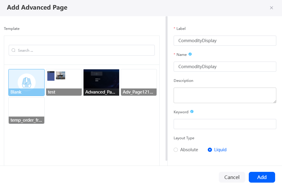
- Create a CommodityDisplay advanced page.The view options are displayed when you create the advanced page for the first time, select Web and Mobile, and set the layout type to Liquid (adaptive layout).Figure 5 Creating the CommodityDisplay advanced page

Table 1 Parameters for creating the CommodityDisplay advanced page Parameter
Description
Example
Label
Label of the advanced page, which can be modified after being created.
Value: 1–100 characters.
CommodityDisplay
Name
Name of the advanced page, which cannot be changed after being created. Naming rules:
- Value: 1–100 characters.
- Start with a letter and can contain only letters, digits, and an underscore (_). Do not end with an underscore (_).
CommodityDisplay
Layout Type
Layout mode of the advanced page.
- Absolute: Each widget can be dragged to any position on the page. The widget width and height can be customized.
- Liquid: Widgets dragged to the page are arranged from top to bottom and from left to right. The widget height adapts to the content size, and the width can be configured by percentage.
Liquid
- Develop the CommodityDisplay advanced page for PCs and mobile devices.
- Click
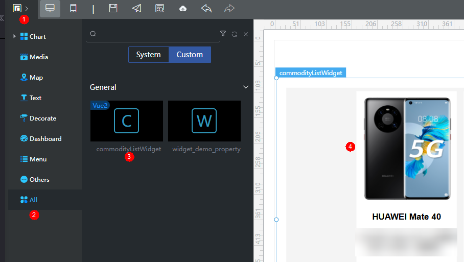
 in the upper left corner of the design page and drag the commodityDetailsWidget widget from All > Custom to the canvas on the right. Figure 6 Dragging the CommodityDisplay widget on the PC
- Click
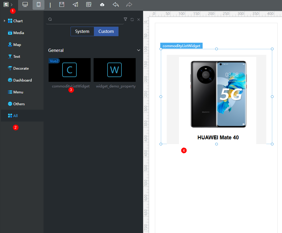
 in the upper part of the page to switch to the mobile device and drag the commodityListWidget widget to the canvas on the right. Figure 7 Dragging the CommodityDisplay widget on the mobile device
- Click
 in the upper part of the page to save the advanced page. Then click
  to release the advanced page.
 - Click
 to go to the preview page and check whether the effect meets the expectation.
- Click
Feedback
Was this page helpful?
Provide feedbackThank you very much for your feedback. We will continue working to improve the documentation.See the reply and handling status in My Cloud VOC.
For any further questions, feel free to contact us through the chatbot.
Chatbot


