
Setting Properties of the Form Widget
A form is a composite widget that can be directly bound to an object model to construct basic form capabilities, such as saving, resetting, and querying (calling the getFormData method through event orchestration). You can also add other widgets that can be bound to model fields, such as input (text box) and select (drop-down list box) widgets, to a blank form to complete data interactions.
Drag a form widget to the page. The Metadata Form Configuration page is displayed. You can bind an object model (see Binding an Object Model) at this time or click Cancel and then bind a model under Data Binding. Alternatively, you can bind model fields to a widget (for example, a text box or a drop-down list box) in the form after the form is designed.


Data Binding
- Value binding: Value binding is similar to the v-model of the Vue. Bidirectional data binding is created on the widget. Value binding automatically selects the correct method to update the element based on the widget type. In addition, it checks events that cause binding data changes to update data.
- In the Data Binding area, click
 in the value binding area. The Select Model dialog box is displayed.
 - Click New.
- Set Model Name and Source, and click Next. Figure 3 Defining a model

There are four types of models: Custom, Objects, Services, and Events. Each type of model contains parameter definitions and method definitions. Methods are APIs defined on models. In general, these APIs are called in event scripts (such as page loading events and mouse click events) associated with frontend widgets to implement certain logic.
Table 1 Model types Type
Model Description
Model Parameter Description
Model Method Description
API Calling Method
Custom
Models defined by developers.
Defined by developers. Subnodes can be added.
Developer-defined method.
$model.ref("modelName").actionName();
Objects
Object models are generated based on the mapping of the object table. For details about the object model, see Objects.
The system automatically obtains all fields of an object. Developers can select some fields as parameters.
The system automatically generates four methods: query, save, delete, and count.
- Query: $model.ref("modelName").query(param);
- Save: $model.ref("modelName").save();
- Delete: $model.ref("modelName").delete();
- Statistics: $model.ref("modelName").count();
Services
Service models are generated by mapping backend services. Currently, service models can only be mapped to flows or scripts. For details about the service model, see Flows and Scripts.
The parameters are mapped to the inputParam and outputParam sections based on the input and output parameters of backend services.
The run method is automatically generated to execute a flow or a script associated with the model.
$model.ref("modelName").run();
Events
For event models, data binding is created based on fields of a backend event. Model data can be updated based on the web socket.
Parameters are generated by mapping fields of backend events.
Directly use.
Directly use.
In addition to the methods defined in models, the platform provides the following standard APIs for all models:
- Obtaining model data: $model.ref("modelName").getData();
- Setting model data: $model.ref("modelName").setData();
- Setting model field values: $model.ref("modelName").setValue(key,value);
- On the Settings page of the new model, perform the following operations:
- If Source is set to Custom in the previous step, you need to add customized parameters and types of subnodes.
- If Source is set to Objects in the previous step, you need to configure the object and fields associated with the model.
- If Source is set to Services in the previous step, you need to configure the backend service associated with the model. The backend service can be a script, flow, or public API.
- If Source is set to Events in the previous step, you need to configure the event and event fields associated with the model.
- Click Next.
Generally, you do not need to add a method. If you need to add or modify a method, refer to the method generated by the object and service by default.
- Click OK.
- In the Data Binding area, click
- Property Binding: Binds a property of a container widget, such as hiding, style, and elastic layout, to a specific model field. Once bound, these properties automatically update in sync with the model field's value, functioning in a manner akin to Vue's v-bind directive.
- In the Data Binding area, click + next to Property Binding.
- Select a property of the container from the Properties drop-down list.
- Under Field, click
 . The model selection page is displayed.
 - Click New.
- Set Model Name and Source, and click Next. There are four types of models: Custom, Objects, Services, and Events. Each type of model contains parameter definitions and method definitions. Methods are APIs defined on models. In general, these APIs are called in event scripts (such as page loading events and mouse click events) associated with frontend widgets to implement certain logic. For details, see Table 1.Figure 4 Defining a model

- On the Settings page of the new model, perform the following operations:
- If Source is set to Custom in the previous step, you need to add customized parameters and types of subnodes.
- If Source is set to Objects in the previous step, you need to configure the object and fields associated with the model.
- If Source is set to Services in the previous step, you need to configure the backend service associated with the model. The backend service can be a script, flow, or public API.
- If Source is set to Events in the previous step, you need to configure the event and event fields associated with the model.
- Click Next.
Generally, you do not need to add a method. If you need to add or modify a method, refer to the method generated by the object and service by default.
- Click OK.
Basic Properties
- Flexible Layout: whether to enable the flexible layout. After this function is enabled, various page layouts can be implemented in a simple, complete, and responsive manner.
- Column: number of columns in the form. This configuration is displayed only when Flexible Layout is enabled.
- Label Alignment: alignment mode of the label, such as left alignment, right alignment, and top alignment.
- Dynamic Items: Enter the option content in JSON format.
Common
- Name: name of the current widget.
- Hide: indicates whether to hide the form widget when previewing a standard page.
- Disable: indicates whether to disable the widget.
- Read-only: indicates whether the value is read-only.
Style
For users with rich frontend development experience, you can use the style panel to customize the page layout.
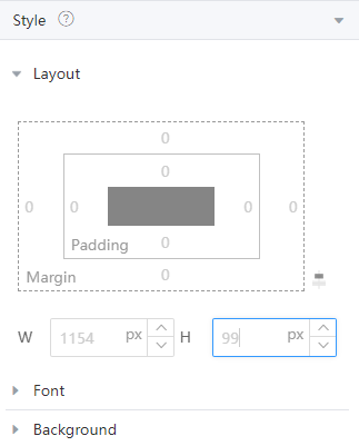
- Layout: You can directly configure the CSS attributes of the page, for example, setting the width and height of a widget. You can also directly compile CSS code in Advance for further layout customization.
- Display: You can quickly set the current element layout to block, inline-block, inline, or flex.
- The box model diagram of the current element is displayed below Display. You can click the corresponding number and change the value to quickly change the inner and outer margins of the element.
- The width and height of the current element are displayed below the current element box model diagram. By default, the width and height are adapted based on the current layout. You can manually enter values to configure the width and height of the current element.
- When configuring the box model, width, and height, you can select multiple units, such as px, em, %, and auto. Figure 5 Style attribute configuration panel
- Font: Set the font size, style, and color.
- Background: Set the background color and transparency.
- Border: Set the border color and width. The unit can be px, em, or %.
- Shadow: Set the shadow color and style. The units px, em, and % are supported.
- Advance: Directly write CSS code to apply to the current element. If the layout style of a widget is set in both Basic Attributes and Style, the settings in Style take effect.
- Style Code: Style code of the widget. After the widget style is set, the style code is automatically displayed in this area. You can also customize the style code to configure the widget in detail. Custom code can be entered in multiple lines, and style parameters are highlighted.
- Style Class: name of the CSS style class of the widget, which can be referenced in the CSS code.
Binding an Object Model
After an object model is bound, you can select the fields of the object to automatically generate a basic form that has the save, reset, and query functions.
- Configure data sources. Select a metadata object in Select Data Object. and select object fields to be displayed. Click Next. Figure 6 Selecting data sources

The model fields bound to the form and its subcomponents must be in the parent-child relationship and cannot cross levels.
- Select the buttons to be displayed in the form. Click Finish. Figure 7 Buttons displayed in the Operation column
 Figure 8 Form property page
Feedback
Was this page helpful?
Provide feedbackThank you very much for your feedback. We will continue working to improve the documentation.See the reply and handling status in My Cloud VOC.
For any further questions, feel free to contact us through the chatbot.
Chatbot


