
Text Editor
The text editor is a type of text widget. It displays text in multiple lines, can be interconnected with datasets and events.
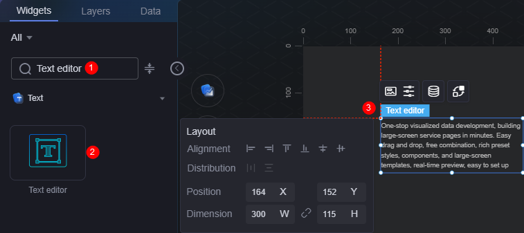
On the large screen design page, drag text editor widget from the All > Text area to the blank area of the canvas, as shown in Figure 1.

Card
A card wraps a chart widget. A widget consists of card elements (card title, chart, card background, and card border) and chart elements.
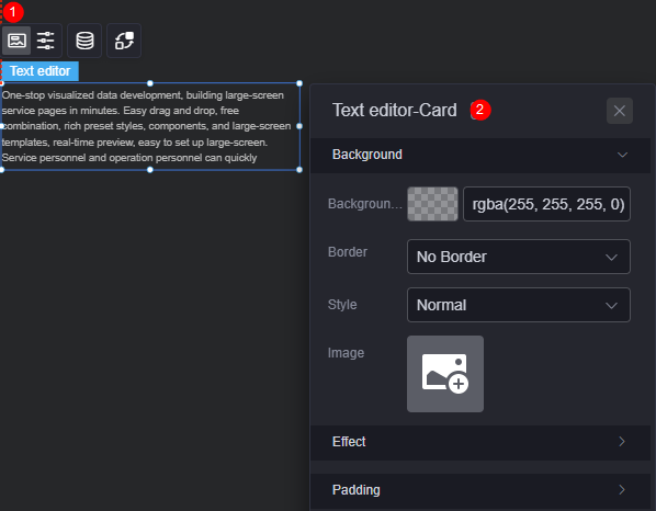
- Background
- Background color: Background color of the widget card.
- Border: Border of the widget card. Options: no border, full border, and corner border. For full border and corner border, you can set the line type and rounded corners of the outer border of the widget.
- Style: Image display style. The options are normal, center, stretch, and tiled.
- Choose image: Use a local image as the widget background. Directories and subdirectories can be added to facilitate image management by category. JPG, JPEG, PNG, or GIF images are recommended. The size of each image cannot exceed 50 MB.
- Special effect: Widget highlighted status. Displayed by default or on page load.
- Padding: Distance between the chart and the four sides (top, bottom, left, and right as shown in Figure 2) of the widget. The default value is 0, indicating that the chart stretches to fill the entire widget.
Configuration
You can set the text, paragraph, and text scrolling of the widget.
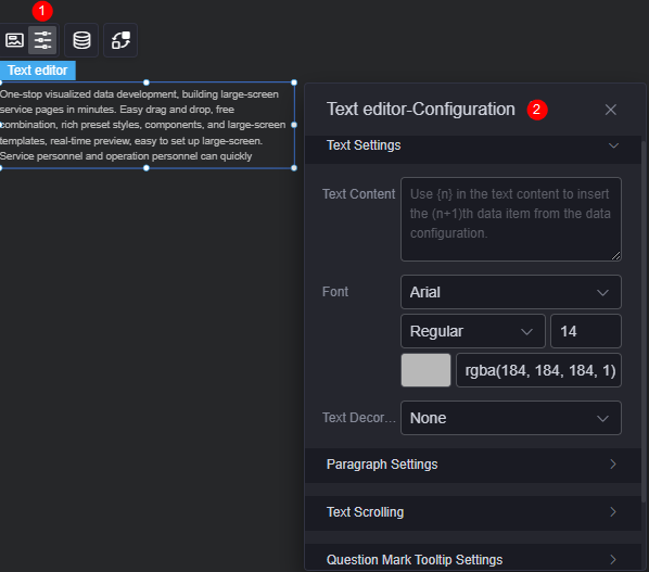
- Text settings
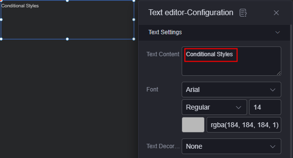
- Text content: Enter the text content. You can also obtain the text content from the background data. For details, see Obtaining Text from Data.
- Font: Font, size, and color of the text.
- Text decoration: Add underscores, strikethroughs, and hyphens to the text.
- Paragraph settings
- Content alignment: If the text content is in multiple lines, it can be centered, left, right, or both ends.
- Text position: If the text content is in one line, it can be centered, left, or right.
- Row height: Set the row height.
- Text spacing: Spacing between texts.
- First line indent: Whether to indent the first line of the text. The value 0 indicates that the first line of the text is not indented.
- Text scrolling
- Scroll display: Whether to display the text in scrolling mode.
- Scrolling mode: Options are up, down, left, and right.
- Scrolling speed: Scrolling speed of the text.
- Question mark prompt
- Question mark prompt: Whether to display the question mark.
- Prompt text: Enter the text content of the question mark.
- Question mark size: Size of the question mark.
- Question mark color: Background color of the question mark.
- Tooltip position: Position of the tooltip, such as upper right corner and top.
- Background: Background color of the tooltip.
- Adding a conditional format: Click the button to add condition formats to set the condition and response data column style. For details, see Adding a Condition Style.
Data
In the data settings, you can set the data source of the text editor widget. For more information, see Data Access.
Interaction
In the interaction settings, you can configure interactions between the text editor widget and other widgets or pages. For details, see Interaction Configuration.
Obtaining Text from Data
- On the large screen design page, drag the text editor widget from the All > Text area to the blank area of the canvas.
- Select the text editor widget and click
 above it to set the data.
Figure 5 Setting the data of the text editor widget
above it to set the data.
Figure 5 Setting the data of the text editor widget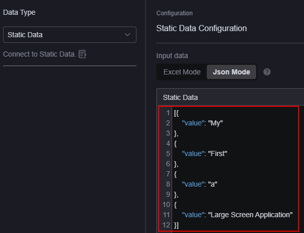
- Select the text editor widget and click
 above it to set the content.
Figure 6 Obtaining data as the text
above it to set the content.
Figure 6 Obtaining data as the text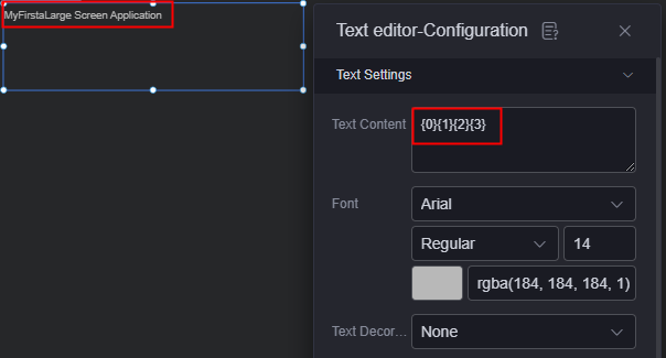
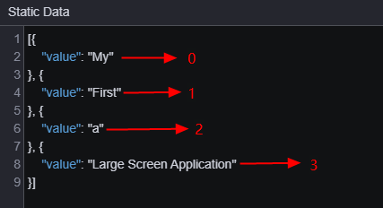
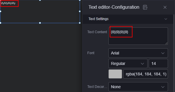
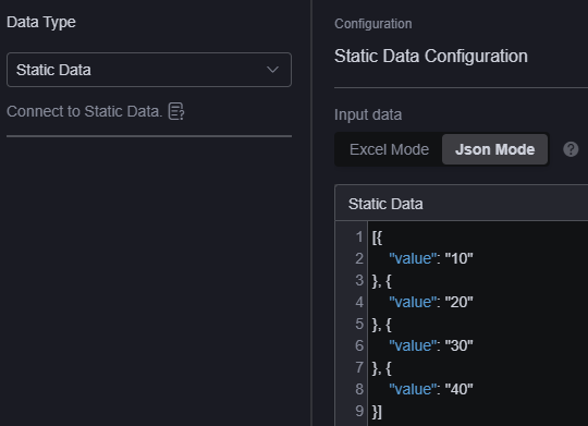
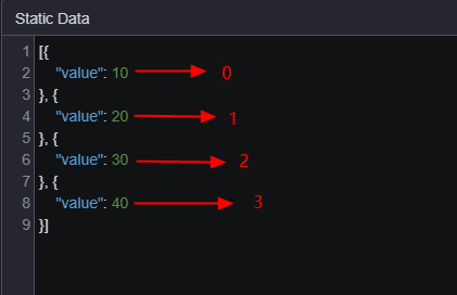
{0} is an escape character. Only {0} and \\{0} escape characters are supported. The number 0 in the escape character is the position of the two-dimensional array in the text editor widget data. See Figure 7. If all are set to {0}, all the first data is displayed, see Figure 8.
Adding a Condition Style
- On the large screen design page, drag the text editor widget from the All > Text area to the blank area of the canvas.
- Select the text editor widget and click above it to set the data.
Figure 9 Configuring widget data
- Select the text editor widget and click above it to set the content.
Figure 10 Text settings
- Click Add Condition Style.
As shown below, this setting indicates that when the first widget data is greater than 5, the text is in red. Otherwise, the text is in the normal color.
Figure 11 Adding a condition style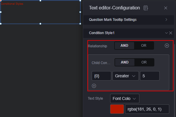
{0} is an escape character. Only {0} and \\{0} escape characters are supported. The number 0 in the escape character is the position of the two-dimensional array in the text editor widget data. See Figure 12.
Feedback
Was this page helpful?
Provide feedbackThank you very much for your feedback. We will continue working to improve the documentation.See the reply and handling status in My Cloud VOC.
For any further questions, feel free to contact us through the chatbot.
Chatbot


