Viewing a Graph
After you add a graph, you can view the metric trends on the Dashboards page. The system provides you both default and customizable time ranges to view trends from last month. This topic describes how to view trends for a longer time range.
Procedure
- Log in to the management console.
- Click Service List in the upper left corner, and select Cloud Eye.
- In the navigation pane on the left, choose Dashboard.
You can view all monitoring graphs on the current dashboard.

- You can sort graphs by dragging them.
- You can click 1h, 3h, 12h, 1d, or 7d in the upper part of monitoring graphs to switch the monitoring periods of all graphs on the dashboard. By default, raw metric data is displayed for 1h and , and the aggregated metric data is displayed for other periods.
- Hover your mouse over a graph. In the upper right corner, click
 to view monitoring details on an enlarged graph. You can select a time period or customize a time range to view the metric trend in a specific monitoring interval.
Raw metric data is displayed for 1h, 3h, 12h, and 1d by default. For 7d and 30d, rolled-up data is displayed by default.
Using the Full Screen
The full screen displays metric data more clearly.
- To enter the full screen, click Full Screen in the upper right corner of the Dashboard page.
- To exit the full screen, click Exit Full Screen in the upper left corner of the page.
Figure 1 Full Screen

Customizing a Period to View the Monitoring Graph
By default, metrics in the last 1 hour, last 3 hours, last 12 hours, last 24 hours, and last 7 days are displayed. If you want to view metrics in the last 2 hours or a customized time period, you can drag the mouse to select the time range you want to view on the X axis.
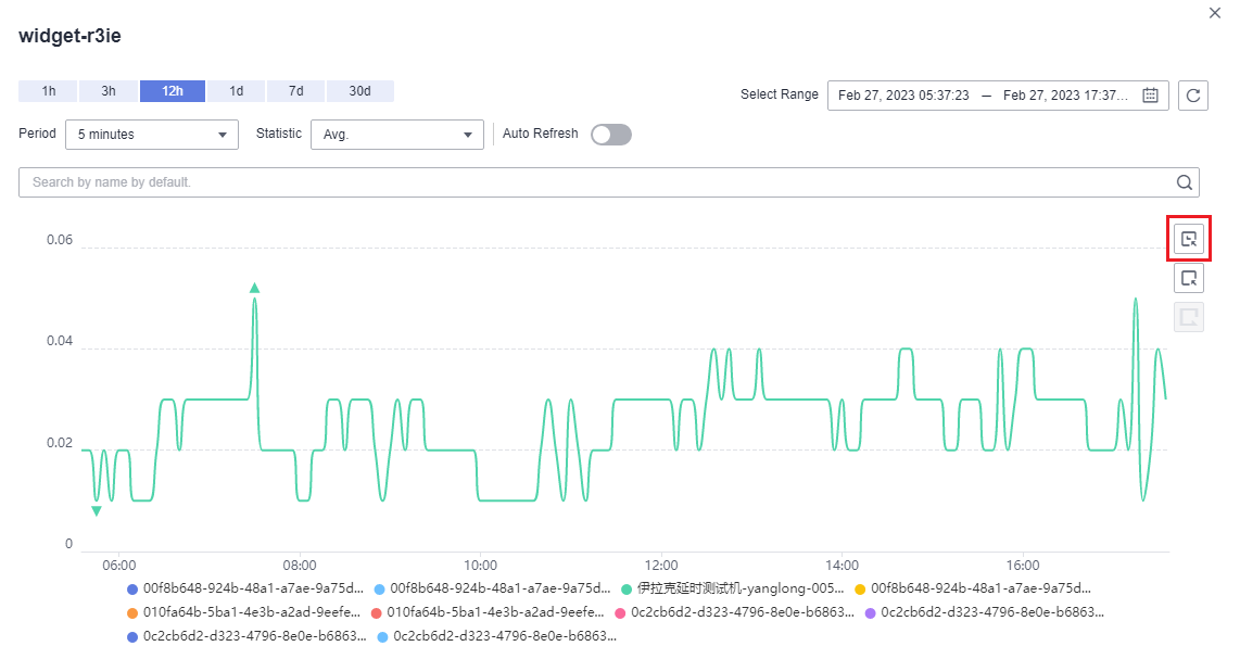
- To view metric details in a customized time period, click the first icon on the right. Drag the mouse to select a customized time range. The system automatically displays the monitoring data in the selected time range.
Figure 2 Customizing a period

- To go back to the default graph, click the third icon on the right.
Selecting Monitoring Objects and Viewing Metrics
To compare the same metric of multiple resources, you can combine the metrics of the resources into a graph. When there are a large number of resources, you can drag to select monitored objects if you want to compare the metric data of only some of the resources.
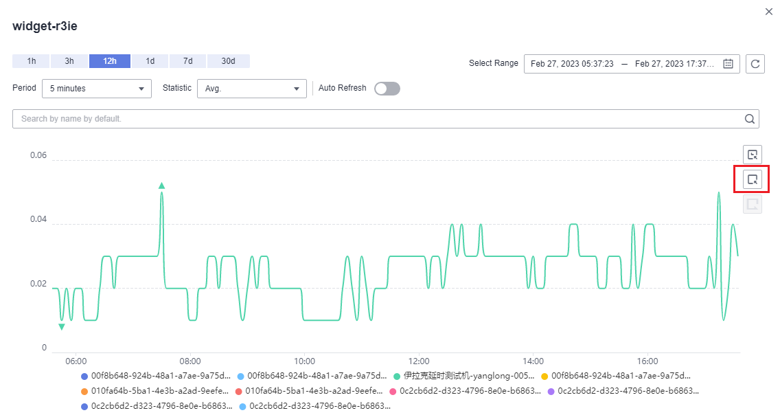
- To select a monitored object, click the second icon on the right. Drag the mouse on part of the curve of the target monitored objects. Then, the system automatically displays the data of the selected monitored objects and hides the monitoring data of other monitored objects.
Figure 3 Selecting the object to be monitored

- To go back to the default graph, click the third icon on the right.

In the lower part of an enlarged graph, you can select a monitored object as follows: Click a resource object to hide its trend chart, and click the monitored object again to display its trend chart.
Feedback
Was this page helpful?
Provide feedbackThank you very much for your feedback. We will continue working to improve the documentation.


