Customizing Widget Properties on Pages
Expected Results
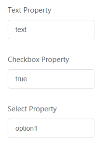
You can customize text, checkbox, and select properties for the widget_demo_property widget. Figure 1 shows the final display effect of customized properties.
Implementation Methods
- Downloading a widget template
- On the Huawei Cloud Astro Zero console, click Access Homepage to go to the application development page.
- Click
 and choose Environments > Environment Configuration.
 - Choose Maintenance from the main menu.
- In the navigation pane, choose Global Elements > Page Assets > Widget Templates.
- In the widget template list, click widgetPropertyTemplate. The template details page is displayed.
- Click Download, set the widget name to widget_demo_property, and click Save. If you select Download original template, the widget name in the downloaded widget package will not be changed.Figure 2 Saving a template

- Customize widget properties
- Define widget properties in propertiesConfig of widget_demo_property.editor.js, including the property type, property name, and label name displayed on the page.
As shown in the following code in bold, widget_demo_property.editor.js defines three property parameters of the text, checkbox, and select types.
widget_demo_property = widget_demo_property.extend({
    /
    Config to define Widget Properties
     */
    propertiesConfig:[{
        config: [{
				"type": "text",
				"name": "textProperty",
				"label": "Text Property",
				"value": "text"
			},
			{
				"type": "checkbox",
				"name": "checkboxProperty",
				"label": "Checkbox Property",
				"value": "true"
			},
			{
				"type": "select",
				"name": "selectProperty",
				"label": "Select Property",
				"options": [{
						"label": "option1",
						"value": "option1",
						"selected": "true"
					},
					{
						"label": "option2",
						"value": "option2"
					}
				]
			}
		]
    }],

    /
    Triggered when the user Creates a new widget and used to initialize the widget properties
     */
    create : function(cbk)
    {
        if(cbk)
        {
            this._super();
            cbk();
        }
    }
});

var params = {};
Studio.registerWidget("widget_demo_property", "widget_demo_property", params);
In the preceding command:
- type: property type.
- name: property name.
- label: property label displayed on the GUI.
- value: property default value. If the property is of the select type, you need to define options.
- In widget_demo_property.js, define the widgetProperties variable var widgetProperties = thisObj.getProperties(). To obtain these properties, invoke the thisObj.getProperties method.
var widget_demo_property = StudioWidgetWrapper.extend({ / Triggered when initializing a widget and will have the code that invokes rendering of the widget */ init : function() { var thisObj = this; thisObj._super.apply(thisObj, arguments); thisObj.render(); if((typeof(Studio) != "undefined") && Studio) { / Register custom event or action here, and trigger the event afterwards. Studio.registerEvents(thisObj, "", "", EventConfig), Studio.registerAction(thisObj, "", "", ActionConfig, $.proxy(this.Cbk, this), ); thisObj.triggerEvent("", ) */ } }, / Triggered from init method and is used to render the widget */ render : function() { var thisObj = this; var widgetProperties = thisObj.getProperties(); var elem = thisObj.getContainer(); var items = thisObj.getItems(); var connectorProperties = thisObj.getConnectorProperties(); / API to get base path of your uploaded widget API file */ var widgetBasePath = thisObj.getWidgetBasePath(); if(elem) { var vm = new Vue({ el: $("#widget_demo_property", elem)[0], data: { form: { textProperty: widgetProperties.textProperty, checkboxProperty: widgetProperties.checkboxProperty, selectProperty: widgetProperties.selectProperty } } }) } / API to bind global events to the item DOM, it should not be deleted if there will some events to trigger in this widget. */ thisObj.sksBindItemEvent(); / API to refresh the previously bound events when a resize or orientation change occurs. */ $(window).resize(function() { thisObj.sksRefreshEvents(); }); }, }); - Define the rendering page in widget_demo_property.ftl and set the property to read-only.
<div id="widget_demo_property">
	<el-form :model="form">
	  <el-form-item label="Text Property">
		<el-input v-model="form.textProperty" :readonly="true"></el-input>
	  </el-form-item>
	 <el-form-item label="Checkbox Property">
		<el-input v-model="form.checkboxProperty" :readonly="true"></el-input>
	  </el-form-item>
	   <el-form-item label="Select Property">
		<el-input v-model="form.selectProperty" :readonly="true"></el-input>
	  </el-form-item>
	</el-form>
</div>
- Compress the developed widget code to a file with the file name extension .zip. You can also click here to obtain the widget sample package widget_demo_property.zip.
- Define widget properties in propertiesConfig of widget_demo_property.editor.js, including the property type, property name, and label name displayed on the page.
- Uploading the widget package to the widget library
- Return to the environment configuration page, choose Maintenance > Global Elements > Page Assets > Widgets, and click Submit New Widget.
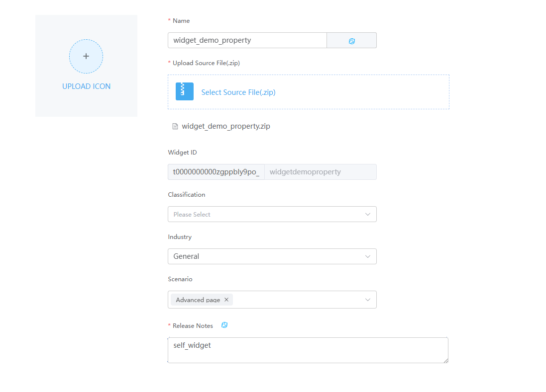
- On the page for submitting a new widget, complete the configuration, upload the compressed file, and click Submit. Figure 3 Uploading a custom widget

Table 1 Parameters for uploading a widget Parameter
Description
Example
Name
Widget name. The system automatically sets this parameter based on the widget package name.
widgetdemoproperty
Upload Source File(.zip)
Source file package of the widget.
Select widget_demo_property.zip in 2.
Scenario
Application scenario of a widget package. You can select multiple application scenarios at a time.
Advanced page
Release Notes
Description of the widget. Set it as required. The information configured here will be displayed on the overview tab page of the widget details page.
Custom widget
- Disable the Vue3 render framework of page widgets. The custom widgets in this practice are developed based on the Vue2 framework. However, the Vue3 render framework of page widgets is enabled by default. You need to manually disable the Vue3 page widgets to avoid the error message displayed when dragging the widget to the page.Figure 4 Displayed error

- Go to the application designer. In the navigation pane, choose Settings.
- In the Advanced Settings area, deselect The render framework of page widgets is upgraded from Vue2 to Vue3. Figure 5 Deselecting

- In the navigation pane, choose Page, and click + next to Advanced Page.
- Click
 in the upper left corner of the design page and drag the custom widget in 3 from Custom to the canvas.
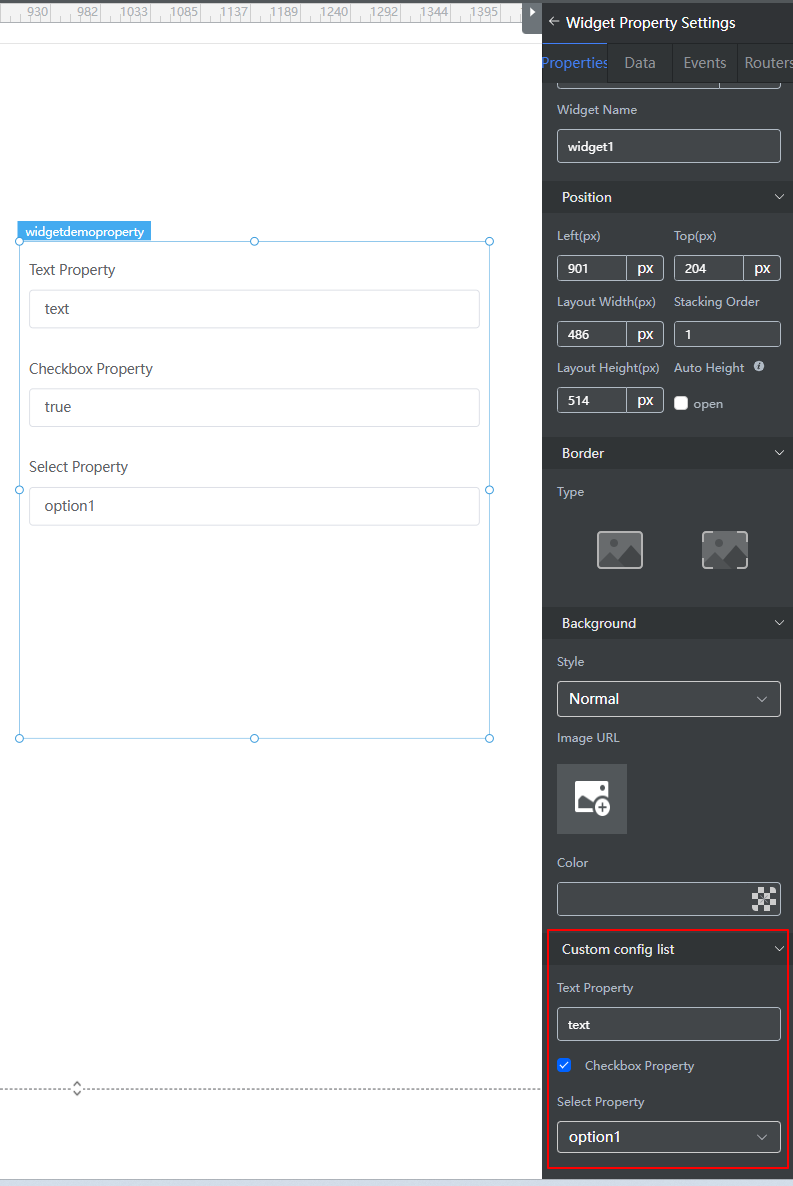
 - Select the widget. The property setting panel of the widget is displayed in the right pane.
- On the Properties tab page, you can view the three custom properties in the custom properties area. Modify the properties as required. Figure 6 Editing the widget properties

Feedback
Was this page helpful?
Provide feedbackThank you very much for your feedback. We will continue working to improve the documentation.See the reply and handling status in My Cloud VOC.
For any further questions, feel free to contact us through the chatbot.
Chatbot


