Time Selector
This section describes parameters of a time selector.
Pattern
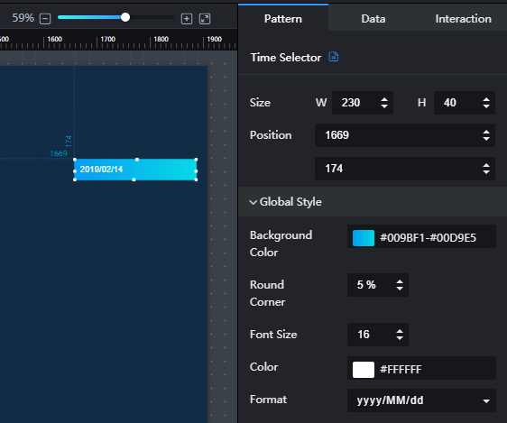
- Size/Position
- Size: width and height of the component. Unit: pixel.
- Position: position where the component is located in the canvas. Unit: pixel.
Figure 1 Time selector
- Global Style
- Background Color: to set the background color of the time selector by clicking the editor.
- Round Corner: to set the round corner angle of the component by clicking
 . A larger value leads to a larger angle. The value ranges from 0% to 50%.
 - Font Size: to set the font size of the component text by entering a value or clicking
 .
. - Color: to set the font color of the component text by clicking the color editor.
- Format: to set the time display format.
Data
date: default time displayed on the component.
Interaction
For details about whether the component supports the interaction function and how to use the interaction function, see Configuring Component Interaction.
Feedback
Was this page helpful?
Provide feedbackThank you very much for your feedback. We will continue working to improve the documentation.See the reply and handling status in My Cloud VOC.
For any further questions, feel free to contact us through the chatbot.
Chatbot


