Carousel Table
This section describes parameters of a carousel table component.
Pattern
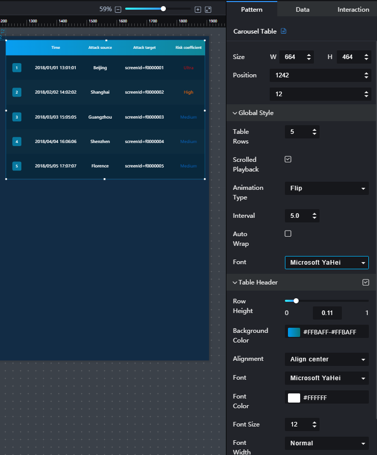
- Size/Position
- Size: width and height of the component. Unit: pixel.
- Position: position where the component is located in the canvas. Unit: pixel.
Figure 1 Carousel table
- Global Style
- Table Rows: to set the number of rows to be displayed in the table by entering a value or clicking
 .
. - Rotate: if Rotate is selected, the content in the table is played in rotation. If this parameter is not selected, the table content is not played in rotation. If the number of rows in the table exceeds the specified number, a scroll bar is displayed. You can slide the scroll bar to view the table data.
- Animation Type: to select an animation type from the drop-down list. The value can be Flip, Marquee, or Beat.
- Interval: to set the interval for rotating the content in the table by entering a value or clicking
 .
. - Automatic Line Feed: If this option is selected, the content in the cell is automatically fed. If this parameter is not selected, the cell content is not automatically wrapped. If the content is too long, only part of the content is displayed.
- Font: to set the font style of the table text from the drop-down list.
- Table Rows: to set the number of rows to be displayed in the table by entering a value or clicking
- Table Header
- Table Header: to show or hide the table header by clicking
 or
or  .
. - Row Height: to set the row height of the table header by entering a value or dragging
 .
. - Background Color: to set the background color of the table header by clicking the color editor.
- Alignment: alignment mode of the text in the table header. The value can be Align center, Left, or Right.
- Font: to select a font style from the drop-down list.
- Font Color: to set the font color by clicking the color editor.
- Font Size: to select a font size from the drop-down list.
- Font Width: to select a font width from the drop-down list.
- Table Header: to show or hide the table header by clicking
- Row Settings
- Odd-numbered Row Background: to set the background color of the odd-numbered rows in the table by clicking the color editor.
- Even-numbered Row Background: to set the background color of the even-numbered rows in the table by clicking the color editor.
- SN
- SN: to show or hide the SN by clicking
 or
or  .
. - Background Color: to set the background color of the SN by clicking the color editor.
- Round Corner: to set the round corner angle of the SN icon by entering a value or clicking
 .
. - Column Width Ratio (%}: to set the width of the SN column by entering a value or dragging
 .
. - Radius: to set the radius size of the SN icon by entering a value or dragging
 .
. - Font Color: to set the font color of the SN by clicking the color editor.
- Font Size: to set the font size of the SN by entering a value or clicking
 .
. - Font Width: to set the font width of the SN.
- SN: to show or hide the SN by clicking
Data
For details about how to configure component data, see Configuring Component Data.
Interaction
For details about whether the component supports the interaction function and how to use the interaction function, see Configuring Component Interaction.
Feedback
Was this page helpful?
Provide feedbackThank you very much for your feedback. We will continue working to improve the documentation.See the reply and handling status in My Cloud VOC.
For any further questions, feel free to contact us through the chatbot.
Chatbot


