
Help Center/ Huawei Cloud Astro Zero/ User Guide (No-Code)/ Creating a Data Report/ Setting the Properties of Widgets on Data Reports/ Setting the Properties of the Bar Chart Widget
Updated on 2025-08-21 GMT+08:00
Setting the Properties of the Bar Chart Widget
This widget compares different data categories. In the bar chart, the length of each rectangle corresponds to the data value of the category.
Figure 1 Bar chart

Name
Set the widget name shown to users. Click  to set Chinese and English names.
Figure 2 Setting the widget name (Chinese and English)

Data
Set the data source of the widget.
Figure 3 Data
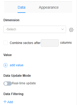
- Dimension: Select a field in the table as the dimension field of the bar chart. The bar chart can use the option fields of the matrix table as the bar chart dimension, and each level is displayed as a value field of the bar chart. Figure 4 Dimension
 Click
Click next to Dimension and set the following parameters:
 - Sorting mode: Set the sorting mode of the dimension, for example, ascending or descending.
- Same name: Whether to merge dimensions with the same name.
- Statistics of null values: Whether to collect statistics on dimensions with null values.
- Merge to "Other" after the Nth bar: Set which bar number to start merging the rest into "Other". For example, the combination starts from the second bar. See the following figure. Figure 5 Uncombined
 Figure 6 Combined
- Value: Select the field whose value is to be displayed. After the setting, click
 to set the value sorting mode (default, ascending, or descending) and whether to display the bar data when the data is 0.
 - Data update mode > Real-time update: Whether the data in the chart needs to be updated in real time.
- Real-time update interval: Set the interval at which the data in the chart is updated. This parameter needs to be set only when the real-time update function is enabled.
- Data Filtering: Click +Add to set filter criteria. You can collect data based on the criteria. For example, filter data for companies that are listed. See Figure 7. Figure 7 No filter criteria added
 Figure 8 Filter criteria added
Appearance
Set the appearance and style of the widget.
Figure 9 Appearance

- Size: Set the size of the bar chart, for example, large, medium, or small. The default value is Large.
- Style: Select the chart style. The default value is Style 1. Figure 10 Effect of setting the chart style to style 3

- X-axis label
- Label line breaks: Whether to wrap a line when there are too many characters on the horizontal axis.
- Max. characters per line: This sets the maximum number of characters displayed in a single line on the horizontal axis. If line breaks are not set, excess characters are omitted. The range is [1,100]. Figure 11 Effect of setting the number of characters to 2

- Label rotation angle: This parameter specifies the rotation angle of the label. The value range is [–90, 90]. The default value is 0, indicating that the label is displayed horizontally. Figure 12 Effect of setting the label rotation angle to 30

- Vertical axis range
- Min. value: Minimum value of the vertical coordinate. The default value is Auto. Figure 13 Effect of setting the minimum value to 1

- Max. value: Maximum value of the vertical coordinate. The default value is Auto. Figure 14 Effect of setting the maximum value to 6

- Number of scales: Set the number of scale lines on the vertical axis. Each line corresponds to a value indicating the height of the data column in the bar chart. Default is Auto. Figure 15 Effect of setting the number of scales to Auto
 Figure 16 Effect of setting the number of scales to 3
- Min. value: Minimum value of the vertical coordinate. The default value is Auto.
- Layout: Select the layout mode of the widget. The options are Auto and Manual. The default value is Auto. When Manual is selected, you can perform the following operations as required:
- Legend layout: Set the list layout of the legend, for example, vertical or horizontal.
- Break words: Whether to enable tag line feed. After this function is enabled, if the number of characters in a label exceeds the maximum number of characters in a single line, the label is automatically wrapped.
- Maximum number of characters in a single line: The value ranges from 1 to 50.
- Item gap: Spacing between legend list items, in pixels.
- Legend position (top margin): Set the percentage from the legend to the top of the widget border.
- Legend position (right margin): Set the percentage of the legend to the right of the widget border.
- Width: Width of the bar in the bar chart. Figure 17 Width

- Conditions: If you check the Hide option, the widget is hidden on the page.
- Width: Ratio of the widget box width to the page width. Adjust the width to optimize the layout and display of the widget on the page, improving overall appearance and usability. Figure 18 Setting the widget width

- 1/4: Widget is 1/4 of the page width.
- 1/3: Widget is 1/3 of the page width.
- 1/2: Widget is 1/2 of the page width.
- 2/3: Widget is 2/3 of the page width.
- 3/4: Widget is 3/4 of the page width.
- 1: Widget is full page width (default).
Feedback
Was this page helpful?
Provide feedbackThank you very much for your feedback. We will continue working to improve the documentation.See the reply and handling status in My Cloud VOC.
The system is busy. Please try again later.
For any further questions, feel free to contact us through the chatbot.
Chatbot


