
Procedure of Customizing Standard Page Widgets
Step 1: Obtain the Widget Template Package
Obtain and use the workCards.zip template package to customize widgets. Learn the structure and definition specifications of the template package first.
- Click here to obtain workCards.zip.
- Unzip the workCards.zip package and learn its structure and definition specifications. Figure 1 Structure of workCards.zip

Table 1 Directories and files in the workCards.zip template package Directory and File
Description
build
Stores the widget packaging script.
dist
Stores widget packaging files. The files are generated in this directory after being packaged.
preview
Widget preview folder.
src
Main folder. The widget content is stored in this folder.
In this practice, you only need to modify the content in the src\components\workCards directory. For details, see Table 2.
.gitignore
Ignored files of Git.
.npmrc
Sets the installation source of the dependency package in package.json.
package.json
Dependency file of the project.
package-lock.json
Used to lock the installation version number of the dependency file.
README.md
Project prompt file, which is used to describe the widget.
vite.config.js
Configuration file of Vite.
Figure 2 src\components\workCards directory structure
Table 2 src\components\workCards directory structure Directory and File
Description
design-time
Directory of widget files in the development environment.
static
Static file directory.
cube.svg/workCards.svg
Icon used in a service.
index.js
Main entry file of the widget.
workCards.json
Widget description file, which is used to customize the widget configuration panel. It helps verify and compile the panel's settings. The workCards.json file must follow JSON Schema specifications to integrate with mainstream editors such as Visual Studio Code (VS Code), Atom, Sublime Text, and WebStorm.
The workCards.json file can be modified during plugin package development or after compilation. Before compilation, it is stored in the directory (as shown in Figure 3). After compilation, it is stored in the directory (as shown in Table 3).
workCards.vue
Main file of a widget.
Figure 4 Location of the workCards.json file after compilation
Table 3 workCards.json parameters Parameter
Description
name
Widget name. The name is used for storing and parsing metadata on the backend.
- The name can contain up to 64 characters. It must start with a letter and can contain only letters, digits, underscores (_), and hyphens (-). It is recommended that the name be in the format of Vendor name_Widget name_Version number, for example, aaa_img-button_1.1.1.
- The widget name is stored in the type of the UI metadata, for example, type: my-component1.
- The name of the ZIP package must be the same as the value of name. For example, if name is set to imgbutton, the ZIP package name must be imgbutton.zip.
title
In the left-hand widget tab, the alias appears beneath each custom widget. Keep it short and descriptive.
Value: 1–100 characters.
description
Widget description. The description that appears when you hover over the widget.
Value: 1–200 characters.
category
Widget category. Assign your widget to one of the platform's predefined categories to keep the UI builder consistent. For details, see Table 4.
icon
Widget icon. There are two PNG icons (unselected and selected status), each no larger than 16 KB.
other
Defines the package size. The compiled widget package must be 1 MB or smaller.
Table 4 Weight categories Category
Description
navigation
Navigation widgets, such as menus, toolbars, or sidebars.
data
Data widgets, which can be used to view and edit data in applications, such as forms, tables, and lists.
common
Common widgets, such as labels, images, titles, and paragraphs.
container
Container widgets, which are used to hold and organize other widgets such as grids, rows, and columns.
input
Displays and edits entity properties, such as text boxes and date selectors.
file
File processing widgets, which include file upload and download, image browsing, and PDF preview.
button
Buttons that trigger actions, such as the save button and page redirection button.
report
Aggregation widgets which display data in tables or charts, such as chart and pivot table widgets.
widget
Service card.
add-on
Extended widgets.

Step 2: Customize the imgButton Widget
In this practice, the imgButton widget is a frontend widget built with Node.js. Unless otherwise specified, this practice uses the imgButton widget as the model for VS Code-based customization.
- Unzip the template package obtained in Step 1: Obtain the Widget Template Package and rename the resulting folder to imgButton.
- Modify the widget description file package.json, change name to imgButton, save the file, and exit.
{ "name": "imgButton", "private": true, "version": "1.0.2", "type": "module", "scripts": { "dev": "vite", "build": "node ./build/build.mjs", "format": "prettier --write src/", "preview": "vite preview" }, "dependencies": { "element-plus": "^2.4.2", "vue": "^3.3.4" }, "devDependencies": { "@vitejs/plugin-vue": "^4.6.2", "jszip": "^3.10.1", "kolorist": "^1.8.0", "sass": "^1.69.5", "unplugin-element-plus": "^0.8.0", "unplugin-vue-components": "^0.25.1", "vite": "^4.4.5", "vue-style-loader": "^4.1.3" } } - Modify the name and components parameters in the manifest.json file in the src folder to imgButton, save the file, and exit.
{ "name": "imgButton", "version": "1.0.2", "type": "uiPackage", "package": { "components": [ "components/imgButton/imgButton.json" ] }, "images": { "default": "./static/package-default.png", "previews": [ "./static/package-preview1.png", "./static/package-preview2.png" ] }, "publisher": "l84182839", "license": "MIT", "keywords": [ "UI Component" ], "categories": [ "ui:components" ], "bugs:url": "", "repository:url": "", "dependencies": [] } - Modify the name of the src\components folder and the file name in the folder from workCards to imgButton. Figure 5 Modifying the folder name
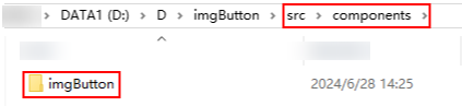 Figure 6 Modifying the file names in the folder
- Replace the widget icon of the custom widget. The icon is the thumbnail of the custom widget displayed in the page builder.
In src\components\imgButton\static, replace default.png (normal status) and hover.png (mouse-over highlight).
- Modify the definition file imgButton.json in src\components\imgButton.
- Modify the basic properties of the widget definition file.
In the imgButton.json file, set name, title, and description to imgButton, and restrict properties to height, width, and text. The code is as follows:
{
  "name": "imgButton",
  "title": "imgButton",
  "description": "imgButton",
  "category": "add-on",
  "icon": {
    "default": "./static/default.png",
    "hover": "./static/hover.png"
  },
  "definition": {
     "props": {
      "type": "object",
      "properties": {
        "height": {
          "category": "common", //Tag to which the property belongs, including common (common), general (basic), and style (style)
          "type": "integer", //Value type of the property, which can be integer (number text box), date (date selection box), string (text box), select (drop-down list), or switch (switch)
          "title": "Image height",//Property title
          "description": "Set the image height.", //Property description, which is displayed when the pointer is hovered over the title
          "default":16 //Default value of the property
        },
        "width": {
          "category": "common",
          "type": "integer",
          "title": "Image width",
          "description": "Set the image width",
          "default":16
        },
        "text": {
          "category": "common",
          "type": "string",
          "title": "framework.label.text",
          "description": "Button text",
          "default":"Button"
        }
      }
    },
  "main": "./index.js",
  "mainDesignTime": "./design-time/index.js",
  "dnd": {
    "cname": "workCards",
    "dname": "workCards-design",
    "ctype": "Control",
    "displayName": "workCards",
    "selectable": true,
    "targetable": true,
    "draggable": true,
    "deletable": true,
    "wholeRow": true
  }
}
After saving the changes, the standard page shows the widget with only height, width, and text properties.
Figure 7 Widget properties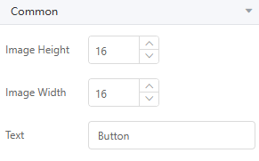
- Modify the event in the widget definition file and change the event name to click.
"on": { "type": "object", "properties": { "click": { // Event name triggered in the code, which is triggered using emit in the widget "title": "Click", //Event name "description": "Action executed upon clicking", //Event description "type": "object" } } }, - Modify the drag behavior in the widget definition file. Set cname, displayName, and dname to imgButton and imgButtonDesign.
"dnd": {
    "cname": "imgButton",
    "dname": "imgButtonDesign",
    "ctype": "Control",
    "displayName": "imgButton",
    "selectable": true,
    "targetable": true,
    "draggable": true,
    "deletable": true,
    "wholeRow": true
  }
cname indicates the widget displayed in the application engine, dname indicates the widget displayed in the application development tool, and displayName indicates the text displayed for the widget in the page builder.
After these modifications, the final imgButton.json is as follows:
{ "name": "imgButton", "title": "imgButton", "description": "imgButton", "category": "add-on", "icon": { "default": "./static/default.png", "hover": "./static/hover.png" }, "definition": { "props": { "type": "object", "properties": { "height": { "category": "common", "type": "integer", "title": "Image height", "description": "Set the image height", "default":16 }, "width": { "category": "common", "type": "integer", "title": "Image width", "description": "Set the image width", "default":16 }, "text": { "category": "common", "type": "string", "title": "framework.label.text", "description": "Button text", "default":"Button" } } }, "on": { "type": "object", "properties": { "click": { "title": "Click", "description": "Action executed upon click", "type": "object" } } }, "methods": { } }, "main": "./index.js", "mainDesignTime": "./design-time/index.js", "dnd": { "cname": "imgButton", "dname": "imgButton", "ctype": "Control", "displayName": "imgButton", "selectable": true, "targetable": true, "draggable": true, "deletable": true, "wholeRow": true } } - Modify the basic properties of the widget definition file.
- Modify the view file imgButton.vue in the src\components\imgButton directory.
- Modify the layout structure of the view file.
Add an img and a span to the layout (div tag) and configure the parameters according to the example. The code example is as follows:
<img
  src="./static/hover.png"
  :height="comHeight"
  :width="comWidth"
  :class="classes + '-img'">
<span :class="classes+ '-title'">
  {{ currentText }}
</span>
img indicates the image in the imgButton button, and span indicates the text in the imgButton button.
- Modify the property definition of the view file imgButton.vue and change cssprefix to imgButton and add the height, width, and text properties.
<script> const cssprefix = "imgButton"; import { defineComponent } from "vue"; export default defineComponent({ name: "imgButton", data() { return { currentText: this.text, }; }, props: { /*Image height */ height: { type: [String, Number], default: "", }, /*Image width */ width: { type: [String, Number], default: "", }, /*Tag text content */ text: { type: String, default: "Button1", }, }, - Modify computed, watch, and methods in the imgButton.vue view file.
  computed: {
    classes() {
      return cssprefix;
    },
    comHeight() {
      return this.height || "16";
    },
    comWidth() {
      return this.width || "16";
    },
  },
  watch: {
    text(newVal) {
      this.currentText = newVal;
    },
  },
  methods: {
    onclick(e) {
      this.$emit("click", e);
    },
    setButtonText(newText) {
      console.log("setButtonText params:", newText);
      if (newText) {
        this.currentText = newText;
      }
    },
  },
After these modifications, the final imgButton.vue is as follows:<template> <div :class="classes" @click="onclick"> <img src="./static/hover.png" :height="comHeight" :width="comWidth" :class="classes + '-img'" /> <span :class="classes + '-title'"> {{ currentText }} </span> </div> </template> <script> const cssprefix = "imgButton"; import { defineComponent } from "vue"; export default defineComponent({ name: "imgButton", data() { return { // emit event to trigger the event set in the definition file. Note that the method names must be the same. currentText: this.text, }; }, props: { /*Image height */ height: { type: [String, Number], default: "", }, /*Image width */ width: { type: [String, Number], default: "", }, /*Tag text content */ text: { type: String, default: "Button1", }, }, computed: { classes() { return cssprefix; }, comHeight() { return this.height || "16"; }, comWidth() { return this.width || "16"; }, }, watch: { text(newVal) { this.currentText = newVal; }, }, methods: { onclick(e) { this.$emit("click", e); }, setButtonText(newText) { console.log("setButtonText params:", newText); if (newText) { this.currentText = newText; } }, }, }); </script> <style lang="scss" scoped> .imgButton { display: inline-block; background-color: #8cdcdb; border: blue1 px solid; cursor: pointer; } .imgButton-img { margin-top: 5px; margin-left: 5px; } .imgButton-title { padding-bottom: 10px; padding-right: 10px; font-size: 16px; cursor: pointer; } </style>Table 5 computed, watch, and methods parameter description Parameter
Description
cssprefix
Constructs the style class name to improve flexibility.
currentText
Displays the button text.
comHeight
Obtains the image height.
comWidth
Obtains the image width.
classes
Returns the style class name. You can also replace the variable with a character string to increase flexibility.
onclick
Triggers the service logic of the click event when the image button is clicked.
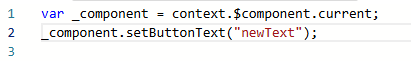
setButtonText
Changes the text in the button. This method is exposed externally. All methods defined in method can be directly called in events. Figure 8 shows the calling mode.
- Modify the style in the view file imgButton.vue to define the style class of the image button. The style class includes the image button frame, image, and text.
.imgButton {
  display: inline-block;
  background-color: #8cdcdb;
  border: blue1 px solid;
  cursor: pointer;
}
.imgButton-img {
  margin-top: 5px;
  margin-left: 5px;
}
.imgButton-title {
  padding-bottom: 10px;
  padding-right: 10px;
  font-size: 16px;
  cursor: pointer;
}
- Modify the layout structure of the view file.
- Modify the control definition file index.js of the application development tool and application engine in the src\components\imgButton\index.js directory. Change workCards in the control definition file to imgButton.
import imgButton from './imgButton.vue'

export default imgButton
- After the custom image is developed, perform the following operations to generate a custom image package.
- On your local PC, press Windows logo key+R and enter cmd to open the command prompt.
- Go to the root directory where imgButton is located and run the following command to generate the custom widget package dist\imgButton-***.zip: If a message is displayed indicating that the Yarn is not installed when you run the yarn commands, run the bnpm install -g yarnb command to install it.
yarn install
yarn run build
Figure 9 Generating a custom widget package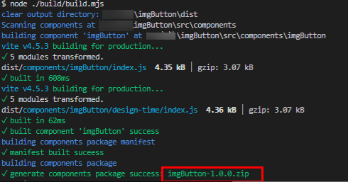
You have completed customizing and packaging the widget. You can compare your generated widget package with the provided imgButton.zip sample.
Step 3: Upload the Custom Widget Package
Upload the custom widget package to Huawei Cloud Astro Zero and use it on standard pages.
- Apply for a free trial or purchase a commercial instance by referring to Authorization of Users for Huawei Cloud Astro Zero Usage and Instance Purchases.
- After you have an instance, click Access Homepage on Homepage. The application development page is displayed. Figure 10 Application development page

- Click
 in the upper left corner of the page and choose Environments > Environment Configuration.
 - On the Environment Configuration page, choose Maintenance from the main menu. Figure 11 Selecting Maintenance

- In the navigation pane, choose Global Elements > Page Assets > Custom Widgets. Figure 12 Selecting a custom widget

- On the displayed page, click New and select the custom widget imgButton.zip created in Procedure of Customizing Standard Page Widgets and upload it.
After the upload is successful, the custom widgets page is displayed. You can view imgButton in the widget list.
Figure 13 Viewing the uploaded custom widget
Step 4: Verify the Custom Widget
Create a standard page and drag the custom widget onto it to check if it displays properly. Add display and hide events for the custom widget and verify that the effects meet the expectations.
- Create a low-code application.
- On the Huawei Cloud Astro Zero console, click Access Homepage to go to the application development page.
- In the navigation pane, choose Applications. On the displayed page, click Low-Code or
 .
. - In the displayed dialog box, choose Standard Applications and click Confirm.
- Enter a label and name of the application, and click the confirm button. The application designer is displayed. Figure 14 Creating a blank application

- In the navigation pane, choose Page, and click + next to Standard Page.
- Drag the input box and column widgets from Basic to the canvas. The layout is shown in Figure 15.
- Select the column widget, choose Properties > Style > Layout, and set the width to 360 pixels. Figure 16 Adjusting the widget width

- Drag the imgButton widget from Custom to the two columns of the column widget. Figure 17 Dragging the imgButton widget to the columns

- Select the custom widget in each column, choose Properties > Common, and set Text to Display in the first and Hide in the second. Figure 18 Modifying the widget text content

- Select the Display widget, click the Events tab, and click + next to on-click. Figure 19 Creating an event

- Under the built-in actions, choose Display/Hide Control and click Add Control. Figure 20 Clicking Add Control

- Select the input widget, set Visibility of the "Display" button to Display, and click Create. Figure 21 Selecting the input widget
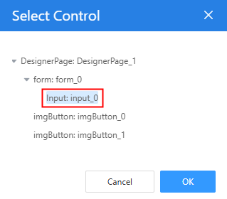 Figure 22 Setting the visibility of the Display button to Display
- Similarly, set Visibility of the Hide button to Hide. Figure 23 Setting the visibility of the hide button to Hide

- Verify the effect.
Click
 in the upper part of the standard page to save the settings. After the settings are saved, click
  . The preview page is displayed. On the preview page, click Hide. The input widget is hidden. Click Display. The input widget is displayed.Figure 24 Preview effect
- Click
 in the upper part of the standard page to save the settings. After the settings are saved, click
  . The preview page is displayed. Figure 25 Preview page
- Click Hide. The input widget is hidden. Figure 26 Input widget hidden

- Click Display. The input widget is displayed. Figure 27 Input widget displayed

- Click

Other Operations: Update the Custom Widget Package
If you change the widget's code, re-upload the updated package to replace the existing version. After the widget content is updated, change the version in src/manifest.json from 1.0.2 to 1.0.3, and run the yarn run build command again. After the packaging is complete, the imgButton-1.0.3.zip package is generated in the dist folder.
- On the Huawei Cloud Astro Zero console, click Access Homepage to go to the application development page.
- Click
 in the upper left corner of the page and choose Environments > Environment Configuration.
 - Choose Maintenance from the main menu.
- In the navigation pane, choose Global Elements > Page Assets > Custom Widgets. In the custom widget list, the current widget version is 1.0.2.Figure 28 Widget version: 1.0.2

- Click New, select the imgButton-1.0.3.zip package, and click Open.
After the update, the custom widget list shows version 1.0.3. Go to the standard page where the custom widget is used. The widget content is updated.
Figure 29 Widget version: 1.0.3
Feedback
Was this page helpful?
Provide feedbackThank you very much for your feedback. We will continue working to improve the documentation.See the reply and handling status in My Cloud VOC.
For any further questions, feel free to contact us through the chatbot.
Chatbot


