
Setting the Properties of the Auto Numbering Widget
This widget automatically generates a number in a custom format for each record.

Name
Set the field name shown to users. Click  to set Chinese and English names. Click Reference Field to copy another field's value to this field name.


Numbering Mode
Numbering mode. By default, it is an ascending sequence starting from 1 (e.g., 1, 2, 3). You can also customize the numbering mode. When the numbering mode is set to Customization, the first numbering rule defaults to Auto Counting. Click  next to Auto Counting to modify the auto counting rule.
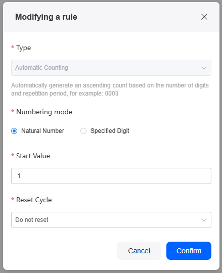
| Parameter | Description |
|---|---|
| Type | Auto counting: Numbers are generated automatically, formatted by digit count and reset period. Example: 0003. |
| Numbering mode | Numbering mode of the auto counting rule.
|
| Start Value | Start value of the number. |
| Digit | Total number of digits. The default value is 4, for example, 0001. Avoid setting the number of digits too few. If the count exceeds the digit limit, it will reset and may cause duplicate numbers. If you choose to continue incrementing past the limit, the numbering will keep increasing. Otherwise, it will restart from 1. This parameter needs to be set only when the numbering mode is set to Specified Digit. |
| Reset Cycle | Set the reset period for auto counting. A suitable reset period helps keep data statistics orderly and logical.
|
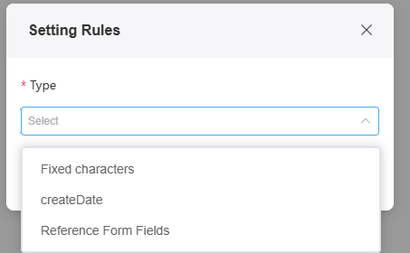
After setting the default auto counting rule, you can add custom numbering rules under Setting Rules based on these requirements:
- Rules are applied from left to right in the generated number.
- [Fixed characters][Creation time][Referenced form field] rules can be added a maximum of twice.
- If the auto-numbering field exceeds 256 characters, data submission will fail.
Conditions
Hide: Choose whether to hide the current field. By default, the auto-numbering field is hidden and not displayed on the page.

Width
The width is the ratio of the widget's width to the page width. Set it to control each widget's layout and display, improving the page's appearance and usability.

- 1/4: Widget is 1/4 of the page width.
- 1/3: Widget is 1/3 of the page width.
- 1/2: Widget is 1/2 of the page width.
- 2/3: Widget is 2/3 of the page width.
- 3/4: Widget is 3/4 of the page width.
- 1: Widget is full page width (default).
Pop-up Message
If a field is unclear, add a Pop-up Message to explain it. This helps users and makes things easier.
After setting, a question mark icon appears next to the field. When filling in the form, click the question mark icon to see the message.

Description
Set the widget description. Include its functions, use cases, and tips. This helps users understand it better and makes the form clearer.

Feedback
Was this page helpful?
Provide feedbackThank you very much for your feedback. We will continue working to improve the documentation.See the reply and handling status in My Cloud VOC.
For any further questions, feel free to contact us through the chatbot.
Chatbot


