Setting Properties of the Flipper Widget
This widget displays real-time data changes on the page. During initialization or data refreshing, the data displayed by the widget changes continuously to a new data.

Basic
- Widget Label: Label of a widget, which is displayed on the advanced page.
- Widget Name: Name of a widget, which is the unique identifier of the widget on the page.
Position
- Left: Left margin of the widget in the canvas. Unit: px.
- Top: Top margin of the widget in the canvas. Unit: px.
- Layout Width: Width of the widget. Unit: px.
- Layout Height: Height of the widget. Unit: px.
- Stacking Order: Order of the widget among others. The default value is 1. The widget with the largest value is on the top. If you want to move a widget to the bottom of a stack, set the parameter to 0.
- Auto Height: whether the widget height changes with the width.
- open: If this option is selected, the page adaptation function is displayed in the lower part.
- Page Adapter: Select open to enable height adaptation for the widget. This property enables the position of other widgets below the page to be automatically adjusted based on the height of the widget. One page supports only one widget.
Border
Border of the widget. Options: Full and Corner.
- Full border
- Style: Style of the widget border. Options: Solid, Dotted, Dashed, and Double.
- Width: Border width, in pixels.
- Color: color of the widget border.
- Radius: radian of the four corners of the widget border, in pixels.
- Corner
- Width: Border width, in pixels.
- Length: Border length, in pixels.
- Color: color of the widget border.
- Radius: radian of the four corners of the widget border, in pixels.
- Padding: Spacing between the widget border and the chart, in pixels.
Background
- Style: Background style. Options: Normal, Center, and Stretch.
- Image URL: Add images for this widget. The image can be in JPG, JPEG, PNG, or GIF format, and the image size cannot exceed 50 MB. The suggested image size is 800 x 800.
- Color: Background color of the widget.
Advanced Settings
Right-click the widget and choose Setting from the shortcut menu to set the style and action of the widget.

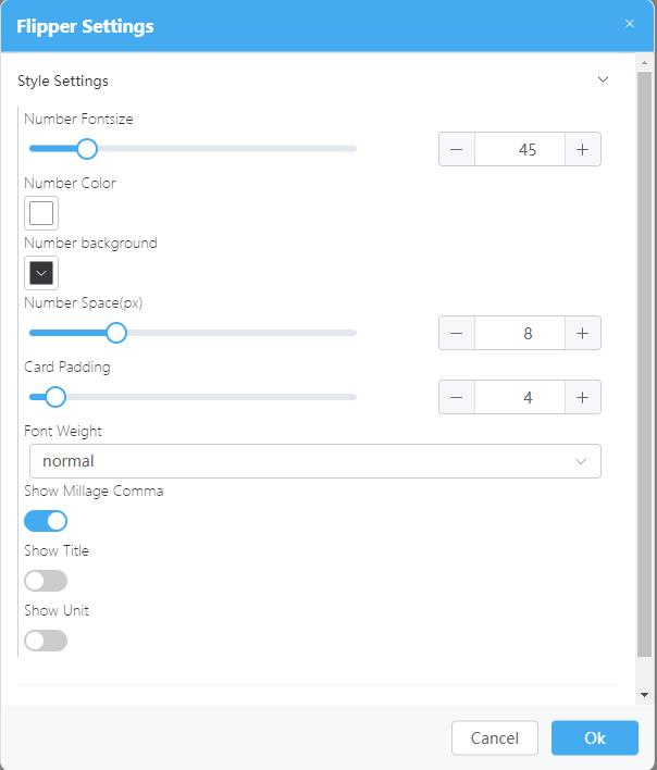
- Style Settings
- Number Fontsize: Size of the number text.
- Number Color: Color of the digit text.
- Number background: Background color of the grid occupied by the number.
- Number Space(px): Distance between digits. The value ranges from 0 to 30 px.
- Card Padding: Margin of the overall number and widget border.
- Font Weight: Font width of the number text.
- Show Millage Comma: Whether to display thousand separators.
- Show Title: Whether to display the title of the flipper widget.
- Show Content: Title of the flipper widget. This parameter is available only when Show Title is enabled.
- Title Align: Alignment mode of the title of the flipper widget. This parameter is available only when Show Title is enabled.
- Title Color: Color of the title. This parameter is available only when Show Title is enabled.
- Title Font Size: Size of the title text. This parameter is available only when Show Title is enabled.
- Show Unit: Whether to display the unit of the flipper number.
- Unit Content: Text content of the unit of the flipper number. This parameter is available only when Show Unit is enabled.
- Unit Color: Color of the unit text of the flipper number. This parameter is available only when Show Unit is enabled.
- Unit Font Size: Size of the unit text of the flipper number. This parameter is available only when Show Unit is enabled.
- Animation Settings
- Animation Type: Animation type of the flipper. The options are Normal Type, Scroll Type, and Flip Type.
- Animation Time(ms): Duration of playing the animation, in ms.
- single transform interval(ms): Interval for a single animation conversion. The unit is ms.
Feedback
Was this page helpful?
Provide feedbackThank you very much for your feedback. We will continue working to improve the documentation.See the reply and handling status in My Cloud VOC.
For any further questions, feel free to contact us through the chatbot.
Chatbot


