
Setting the Properties of the Rich Text Widget
This widget is used to input text and supports text and images.

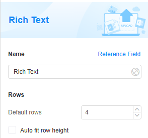
Name
Set the field name shown to users. Click  to set Chinese and English names. Click Reference Field to copy another field's value to this field name.


Rows
Set the default number of rows. The row height adjusts automatically based on the content. Default is four rows, meaning only four lines of text are shown. To view more than four lines, use the scroll bar.

Verification
Mandatory: If checked, the field is required and shows a * next to it.

Conditions
- Read-only: If checked, the field is read-only.
- Disable: If checked, the field shows but cannot be edited.
- Hide: If checked, the field is hidden on the page.
Pop-up Message
If a field is unclear, add a Pop-up Message to explain it. This helps users and makes things easier.
After setting, a question mark icon appears next to the field. When filling in the form, click the question mark icon to see the message.

Description
Set the widget description. Include its functions, use cases, and tips. This helps users understand it better and makes the form clearer.

Feedback
Was this page helpful?
Provide feedbackThank you very much for your feedback. We will continue working to improve the documentation.See the reply and handling status in My Cloud VOC.
For any further questions, feel free to contact us through the chatbot.
Chatbot


