
Setting the Properties of the Email Address Widget
This widget records email information. The platform checks email addresses. If one is invalid, it shows an error. Example format: ***@example.com.

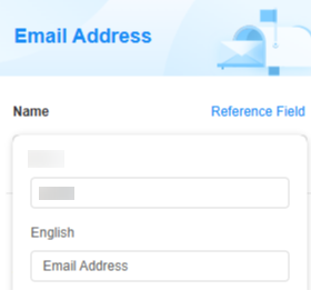
Name
Set the field name shown to users. Click  to set Chinese and English names. Click Reference Field to copy another field's value to this field name.

Hyperlink If Read-Only
If this is checked, the field is displayed as a hyperlink.
Verification
- Mandatory: If checked, the field is required and shows a * next to it.
- Unique: If checked, the field value cannot be repeated.
Conditions
- Read-only: If checked, the field is read-only.
- Disable: If checked, the field shows but cannot be edited.
- Hide: If checked, the field is hidden on the page.
Width
Width: Widget width as a ratio of the page width. Set the widget width to make the page look better and more professional.

- 1/4: Widget is 1/4 of the page width.
- 1/3: Widget is 1/3 of the page width.
- 1/2: Widget is 1/2 of the page width.
- 2/3: Widget is 2/3 of the page width.
- 3/4: Widget is 3/4 of the page width.
- 1: Widget is full page width (default).
Default Value
Set a default value for the widget (defaults to "Please enter" if not set). This reduces user input, speeds up processes, and prevents invalid entries.
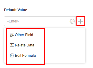
- Other field: Fields from other widgets, such as email address widgets and associated record widgets.
- Relate data: Link to existing data. The latest record is used as the default.
- Formula editing: After you add a formula to a field, its value is calculated automatically when you fill in or change the form. Figure 6 Formula editing

Guide Prompt
If a user does not set this parameter, the text displayed on the GUI guides the user to perform correct operations.

Pop-up Message
If a field is unclear, add a Pop-up Message to explain it. This helps users and makes things easier.
After setting, a question mark icon appears next to the field. When filling in the form, click the question mark icon to see the message.

Description
Set the widget description. Include its functions, use cases, and tips. This helps users understand it better and makes the form clearer.

Feedback
Was this page helpful?
Provide feedbackThank you very much for your feedback. We will continue working to improve the documentation.See the reply and handling status in My Cloud VOC.
For any further questions, feel free to contact us through the chatbot.
Chatbot


