Help Center/
Data Lake Visualization/
User Guide (ME-Abu Dhabi Region)/
Component Guide/
Design/
Custom Background
Updated on 2025-01-22 GMT+08:00
Custom Background
This section describes parameters of a custom background component.
Pattern
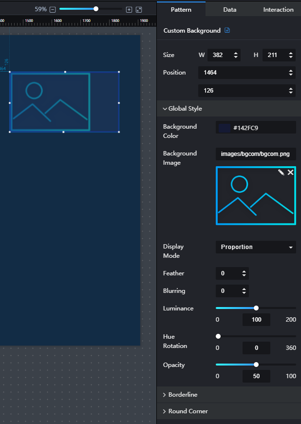
- Size/Position
- Size: width and height of the component. Unit: pixel.
- Position: position where the component is located in the canvas. Unit: pixel.
Figure 1 Custom background
- Global Style
- Background Color: to set the background color of the component by clicking the color editor.
- Background Image: to set the background image of the component by clicking to upload an image from the local computer.
- Display Mode: to set the display mode of the background image. The value can be Default, Proportion, Crop, or Stretch.
- Feather: to set the edge blurring degree of the component by entering a value or clicking
 . When the value is set to 0, the edge will not be blurred. A larger value leads to a blurrier edge.
 - Blurring: to set the blurring degree of the component by entering a value or clicking
 . When the value is set to 0, the background will not be blurred. A larger value leads to a blurrier background.
 - Luminance: to set the color brightness of the background component by entering a value or clicking
 . When the value is set to 0, the background is dark. A larger value leads to a brighter background component.
 - Hue Rotation: to set the hue value of the background component by entering a value or dragging
 . The value range of the hue indicates the angle range of the color wheel. When the value is set to 0, the color does not change.
 - Opacity: to set the opacity of the background component by entering a value or dragging
 . When the value is set to 0, the background is completely transparent. When the value is set to 100, the background is opaque.
- Borderline
- Pattern: borderline style of the background component. The value can be Solid line, Dotted line, or Dash-dot line.
- Width: borderline width of the background component. When the value is set to 0, the borderline is hidden. The greater the value is, the thicker the borderline is.
- Color: borderline color of the background component.
- Round Corner
- Upper-Left Corner: to set the angle of the upper-left corner of the background component. A larger value leads to a larger round-corner angle. The value ranges from 0% to 50%.
- Upper-Right Corner: to set the angle of the upper-right corner of the background component. A larger value leads to a larger round-corner angle. The value ranges from 0% to 50%.
- Lower-Right Corner: to set the angle of the lower-right corner of the background component. A larger value leads to a larger round-corner angle. The value ranges from 0% to 50%.
- Lower-Left Corner: to set the angle of the lower-left corner of the background component. A larger value leads to a larger round-corner angle. The value ranges from 0% to 50%.
Data
- bg: address of the background image.
- If you set bg, the image configured by bg is preferentially displayed on the screen.
- If you do not set bg, the Background Image under Global Style on the Pattern tab page is displayed on the screen.
- If you do not set Background Image, only a blue background frame is displayed on the screen.
- Data Source Type: to select the data source of the chart. Multiple data sources are provided for you to select. You need to add data sources first. For details, see Data Connection Overview.
- Converter: Select a converter to convert data into the data that meets the display requirements. For details, see Using a Converter.
- Automatic Update: If you select Automatic Update and set Update Interval, the data is automatically updated based on the interval.
- Preview Result: Click Preview Result to view the information about the selected data source. You can click Update Query to manually update the component data when the data source changes.
Interaction
For details about whether the component supports the interaction function and how to use the interaction function, see Configuring Component Interaction.
Parent topic: Design
Feedback
Was this page helpful?
Provide feedbackThank you very much for your feedback. We will continue working to improve the documentation.See the reply and handling status in My Cloud VOC.
The system is busy. Please try again later.
For any further questions, feel free to contact us through the chatbot.
Chatbot


