
gui.json File
gui.json is a component's configuration file. This section describes the fields in gui.json. You can modify the file and customize the component configuration panel based on the field description in this document.
1 2 3 4 5 6 7 |
{ "name": "newCom", "style": [...], "data": {}, "dataSlot": {...}, "event": {...} } |
|
Parameter |
Mandatory |
Type |
Description |
|---|---|---|---|
|
name |
Yes |
String |
Component name. |
|
style |
Yes |
Array of Style object |
Style panel configuration. |
|
data |
Yes |
{} |
Stores updated component data. Retain the value {}. Do not delete it. |
|
dataSlot |
No |
Object |
Data panel configuration. For details, see Configuring Component Data. |
|
event |
No |
Object |
Interaction panel configuration. For details, see Configuring Component Interaction. |
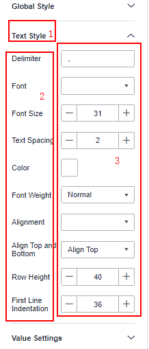
Configuring the Component Style
1 2 3 4 5 6 7 8 9 10 11 12 13 14 15 16 17 18 19 20 21 22 23 24 25 26 27 28 29 30 31 32 33 34 35 36 37 38 39 |
"style": [ { "label": "Global style", "labelId": "global_style", "isExpand": true, "children": [ { "label": "Font size", "name": "fontSize", "type": "number", "min": 12, "max": 32, "value": 12 }, { "label": "Font weight", "name": "fontWeight", "type": "select", "options": [ { "key": "Normal", "value": "normal" }, { "key": "Bold", "value": "bold" } ], "value": "normal" }, { "label": "Color", "name": "color", "type": "color", "value": "#ffffff" } ] } ], |
The Style parameter is an array that contains configuration items for styling. Each data element in the array can also include related sub-configuration items, with a maximum of two layers. Here are the specific parameter details:
|
Parameter |
Mandatory |
Type |
Description |
|---|---|---|---|
|
label |
Yes |
String |
Label name of a configuration item. |
|
isExpand |
No |
Boolean |
Whether sub-configuration items are expanded. The options are:
|
|
name |
Yes |
String |
Key value of the configuration item, which must be unique for the current component. |
|
Other |
No |
- |
UI types have different attribute parameters. For details, see UI Types. |
|
children |
No |
Array of children object |
Sub-configuration items of the configuration item. The Global Style area contains configurations like Font and Color. |
|
Parameter |
Mandatory |
Type |
Description |
|---|---|---|---|
|
label |
Yes |
String |
Label name of a sub-configuration item. |
|
type |
Yes |
String |
Type of the text box for style configuration. For the UI types supported by DataArts Insight, see UI Types. |
|
name |
Yes |
String |
Key value of the sub-configuration item, which must be unique for the current component. |
|
value |
Yes |
String | Number |
Style value of the sub-configuration item. |
|
Other |
Yes |
- |
UI types have different attribute parameters. For details, see UI Types. |
Example:
|
No. |
Description |
|---|---|
|
1 |
The corresponding field is isExpand. |
|
2 |
The corresponding field is label. |
|
3 |
The corresponding field is type, with options including number, select, and color. |
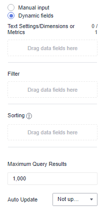
Configuring Component Data
dataSlot: component's data panel slot configuration.
1 2 3 4 5 6 7 8 9 |
"data": { "version": "2.0" "dynamicData": { "slots": [...], "filter": true, "sort": true }, } |
|
Parameter |
Mandatory |
Type |
Description |
|---|---|---|---|
|
version |
Yes |
"2.0" |
The value is fixed at 2.0. |
|
slots |
Yes |
Slot[] |
Data configuration area in the data panel. For details, see slots parameter description. |
|
filter |
Yes |
Boolean |
Whether to display filter slots on the data panel. |
|
sort |
Yes |
Boolean |
Whether to display sorting slots on the data panel. |
- Example dataSlot configuration
In the example, the dataSlot parameter is as follows:
 1
 2
 3
 4
 5
 6
 7
 8
 9
10
11
12
13
14
15
16
17
18
"dataSlot": {
  "version": "2.0",
  "dynamicData": {
    "slots": [
      {
        "areaId": "area_value",
        "label": "Metric slot",
        "rule": {
          "maxColNum": 1,
          "mimColNum": 0,
          "needAggregator": true
        }
      }
    ],
    "filter": true,
    "sort": true
  }
},
The definition of slots is as follows:
Table 6 slots parameter description Parameter
Mandatory
Type
Description
areaId
Yes
String
Data slot type. For the options, see AreaId description.
label
Yes
String
Display name of a data slot.
rule
No
Object
Rules and constraints for configuring data slots. For details, see rule description.
- AreaId description
AreaId identifies the slot type of the data panel. The values include:
Table 7 AreaId value description Value
Description
area_column
Column slot, which supports dimensions and metrics.
area_type
Dimension slot, which only supports dimension fields.
area_value
Metric slot, which only supports metric fields.
area_color
Color legend slot, which supports only dimensions and is used to classify data.
- rule description
rule indicates the slot rules of the data panel. The rule parameter is as follows:
Table 8 rule value description Value
Mandatory
Type
Description
minColNum
No
Number
Minimum number of fields required for a slot on the data panel.
maxColNum
No
Number
Maximum number of fields supported by a slot on the data panel.
dataType
No
String[]
Supported field type. The options are STRING, DATE, and NUMBER. If this parameter is not set, it will default to the type that matches AreaId. For details, see AreaId description.
typeErrorTip
No
String
Prompt message displayed when the field type dragged to the data panel slot does not match the slot type.
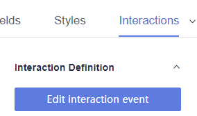
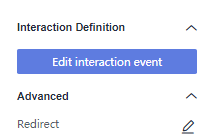
Configuring Component Interaction
event: component interaction configuration.
An example is shown below:
"event": {
  "eventConfig": [
    {
      "type": "select"
    }
  ]
}
The Event parameter is an object in the form of key-value pairs. The key represents the name of the interaction event, and the value contains the relevant configuration for the interaction event. The details are as follows:
|
Parameter |
Mandatory |
Type |
Description |
|---|---|---|---|
|
eventConfig |
Yes |
Arrary |
Interaction configuration. The value is an array. |
|
Parameter |
Mandatory |
Type |
Description |
|---|---|---|---|
|
type |
Yes |
select, drive, and link |
|

Feedback
Was this page helpful?
Provide feedbackThank you very much for your feedback. We will continue working to improve the documentation.See the reply and handling status in My Cloud VOC.
For any further questions, feel free to contact us through the chatbot.
Chatbot


