
Progress Bar
This section describes the parameters for a progress bar.
Field
In the Data area, select values from the Category Axis/Dimension list and Axis Value/Metric list.
- Manual input: You need to manually enter the target value and progress value.
- Dynamic input: The Fields tab also offers the following parameters to help you analyze data:
- In the Data area on the right, select a dataset, and double-click or drag required dimension and metric fields to the corresponding areas on the Fields tab.
- Set a filter.
- Find the data field you need in the dimension and metric lists within the data column.
- Click
 next to the field you wish to filter and you will be directed to the filter settings page.
 - Click OK.
Table 1 Filter parameters Type
Parameter
Description
string
Condition
Filter Mode: The options are Condition and Enumeration.
Condition Type: The options are And condition and Or condition.
Filter Condition: The options are Exact match, Contain, Start with, End with, Not match, Not contain, Null, and Not null.
Enumeration
Query Mode: The options are Single-select and multi-select.
Filter Condition: The options are >, ≥, <, ≤, =, ≠, Null, and Not null.
Metric
Condition Type
The options are And condition and Or condition.
Filter Condition
The options are >, ≥, <, ≤, =, ≠, Null, and Not null. You can select Before aggregation and After aggregation for data.
NOTE:If you select Before aggregation, data is filtered before aggregation. If you select After aggregation, data is filtered after aggregation. For aggregation concepts, see Creating a Dataset.
You can click Create Filter Condition to set multiple filter criteria.
Date
Range value
Select a time range for filtering.
Single value
Set a single time for filtering.
Condition
You can select And condition or Or condition as the condition type and select filter condition like >, ≥, <, ≤, and =.
You can click Create Filter Condition to set multiple filter criteria.
- Set sorting.
- Drag and drop required data fields from the Dimension and Metric (Indicator) areas under Data to the Sorting area.
- Click
 next to a field in the Sorting area and select a sorting mode. The sorting modes are Ascending, Descending, and Custom.
 - To cancel sorting, click
 next to the sorting field.
- Set the maximum number of query results.
Enter the maximum number of records that can be returned in the text box. The default value is 1000.
- Set automatic refresh.
The auto refresh interval supports the following options: no refresh, 1 minute, 5 minutes, 15 minutes, and 30 minutes.
Style
- Size/Position
- W: width of the target, in pixels.
- H: height of the target, in pixels.
- X: position of the target on the canvas, in pixels.
- Y: position of the target on the canvas, in pixels.
- Opacity: Adjust the transparency of the target on the canvas using a slider or by manually entering a percentage. A higher percentage means lower transparency.
Figure 1 Size/Position
- Progress Bar: The bar width, radius of rounded corners, background color, and progress bar color can be customized.
You can select a pure color or a gradient color for the progress bar. Gradient colors can be set with start and end colors, and the start and end colors can also be swapped.
- Proportion
- Show Proportion: You can determine whether to display the proportion.
- Decimal Places: There can be up to 10 decimal places.
- Proportion Text: The font type, numerical color, numerical font size, and font weight can be customized.
- Offset: The horizontal offset ranges from -1000 to 1000.
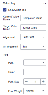
- Value labels
- Show Value Labels: If the checkbox is selected (
 ), value labels are displayed. If the checkbox is not selected (
 ), value labels are not displayed.
 - Current Value Name: name of the current value.
- Target Value Name: name of the target value.
- Alignment: The options include Left/Right and Top/Bottom.
- Arrangement: The options are Top, Right, Inside, Left, Bottom, Upper Left Corner, Lower Left Corner, Upper Right Corner, and Lower Right Corner.
- Text: You can set the font, color, font size, and font weight of the value tag.
Figure 2 Value labels
- Show Value Labels: If the checkbox is selected (
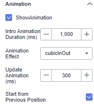
- Animation
- Show Animation: If the checkbox is selected (
 ), animations are displayed. If the checkbox is not selected (
 ), animations are not displayed.
 - Intro Animation Duration (ms): duration of the first rendering of the component, in ms.
- Animation Effect: The system provides multiple common animation slow-moving effects.
- Update Duration (ms): animation duration when the component data is updated, in ms.
- Start from Previous Position: If this option is selected, the animation is played from the position of the previous data when the component data is updated. If this option is deselected, the animation is played from the initial position when the component data is updated.
Figure 3 Animation
- Show Animation: If the checkbox is selected (
Feedback
Was this page helpful?
Provide feedbackThank you very much for your feedback. We will continue working to improve the documentation.See the reply and handling status in My Cloud VOC.
For any further questions, feel free to contact us through the chatbot.
Chatbot


