
Circular Progress Bar
This section describes parameters of a circular progress bar.
Field
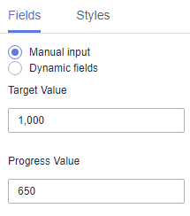
- For manual input, you need to manually enter the target value and progress value.
Figure 1 Manual input
- Dynamic fields
- In the axis value/metric list, select fields and drag and drop them to the Progress Value/Target Value/Metric area.
- Filter: If you have a large amount of data, you can enable the filter function to filter out the required data categories from the dataset. Filters can filter character, numeric, and date data.
Filter Settings: Click
 next to the field you wish to filter and you will be directed to the filter settings page.
- Filter field selection dimension
- Non-time fields
Table 1 Filter parameters Parameter
Description
Dataset
The dataset selected for constructing the large screen component.
Selected Field
The fields selected for filtering (non-time fields).
Filter Mode
When the selected field is a dimension, filtering can be done by condition or enumeration.
Condition Type
When the selected field is a dimension and filtering is done by condition, both AND and OR conditions are supported.
When the selected field is a dimension and filtering is done by enumeration, single or multiple selections are supported.
Filter Criteria
When the selected field is a dimension and filtering is done by condition, the following conditions can be set: exact match, contains, starts with, does not match, does not contain, is empty, is not empty, etc.
When the selected field is a dimension and filtering is done by enumeration, the corresponding field can be selected.
- Time fields
Table 2 Filter parameters Parameter
Description
Dataset
The dataset selected for constructing the large screen component.
Selected Field
The fields selected for filtering (time fields).
Filter Mode
When the selected field is a dimension, filtering can be done by single value, range value, or condition.
Filter Criteria
When the selected field is a dimension and filtering is done by single value or range value, the filtering conditions support both absolute and relative time.
When the selected field is a dimension and filtering is done by condition, both AND and OR conditions are supported.
- Non-time fields
- Filter field selection metric
Table 3 Filter parameters Parameter
Description
Dataset
The dataset selected for constructing the large screen component.
Selected Field
Select the fields to be filtered.
Condition Type
When the selected field is a metric and filtering is done by condition, both AND and OR conditions are supported.
Filter Criteria
When the field to be set is a metric, filtering conditions support settings such as >, ≥, <, ≤, =, ≠, is empty, is not empty, etc. It also supports settings before and after data aggregation.
- Filter field selection dimension
- Sorting: Sorts the dragged class axis/dimension fields in ascending or descending order.
Sorting settings: Click
 of the sorting field and choose the desired order.
Sorting by metric: Metric fields in the sorting slots are not displayed in the chart by default. To display them, drag and drop them into the metric slots.
- Set Maximum Query Results. The value ranges from 1 to 5000.
- Auto-refresh: Set the time for data refresh, which can be 1 minute, 5 minutes, 15 minutes, 30 minutes, or no refresh.
Click Update to automatically update the chart.
Style
This part describes style parameters of a circular progress bar.
- Size/Position
- W: width of the target, in pixels.
- H: height of the target, in pixels.
- X: position of the target on the canvas, in pixels.
- Y: position of the target on the canvas, in pixels.
- Opacity: Adjust the transparency of the target on the canvas using a slider or by manually entering a percentage. A higher percentage means lower transparency.
- Progress Bar
- Inner Radius: inner radius. The value cannot be left blank and must range from 0 to 100.
- Outer Radius: outer radius. The value cannot be left blank and must range from 0 to 100.
- Background Color: background color of the progress bar.
- Progress Bar Color: color of the progress bar.
- Proportion
- Show Proportion: If the checkbox is selected (
 ), the proportion is displayed. If the checkbox is not selected (
 ), the proportion is not displayed.
 - Decimal Places: number of decimal places. The value cannot be left blank and must range from 0 to 10.
- Proportion Text: You can set the font, numerical color, numerical font size, and font weight.
- Offset: You can set both the horizontal offset and vertical offset.
- Show Proportion: If the checkbox is selected (
- Value Tag
- Show Value Tag: If the checkbox is selected (
 ), value tags are displayed. If the checkbox is not selected (
 ), value tags are not displayed.
 - Current Value Name: name of the current value.
- Target Value Name: name of the target value.
- Alignment: The options include Left/Right and Top/Bottom.
- Arrangement: The options are Top, Right, Inside, Left, Bottom, Upper Left Corner, Lower Left Corner, Upper Right Corner, and Lower Right Corner.
- Text: You can set the font, color, font size, and font weight of the value tag.
- Show Value Tag: If the checkbox is selected (
- Tooltips: Set whether to display tooltips.
- Animation
- Show Animation: If the checkbox is selected (
 ), animations are displayed. If the checkbox is not selected (
 ), animations are not displayed.
 - Intro Animation Duration (ms): duration of the first rendering of the component, in ms.
- Animation Effect: The system provides multiple common animation slow-moving effects.
- Animate Sequentially: If this option is selected, the series are animated in sequence. If this option is deselected, all series are animated at the same time.
- Update Duration (ms): animation duration when the component data is updated, in ms.
- Start from Previous Position: If this option is selected, the animation is played from the position of the previous data when the component data is updated. If this option is deselected, the animation is played from the initial position when the component data is updated.
- Show Animation: If the checkbox is selected (
Chart Display

Feedback
Was this page helpful?
Provide feedbackThank you very much for your feedback. We will continue working to improve the documentation.See the reply and handling status in My Cloud VOC.
For any further questions, feel free to contact us through the chatbot.
Chatbot


