Standard Page Overview
What Is a Standard Page?
Standard pages are zero- and low-code frontend development tools provided by Astro Zero. They enable you to add, delete, modify, and query service data easily. The key advantage of standard pages is that they come with pre-styled widgets that have encapsulated basic event code, eliminating repetitive tasks and allowing you to focus on your services. You can simply drag one or more widgets onto a canvas and configure them with minimal or no code to quickly create functional front-end pages.
Common service applications like leave e-flow, business trip reimbursement, and online voting primarily perform basic operations: adding, deleting, modifying, and querying service data. These applications feature straightforward frontend page designs. You can use the standard pages provided by the platform.
The widgets with preset styles on standard pages have encapsulated basic event code, avoiding repeated work and enabling you to focus on services.
Standard Page Development Workbench
Access the application designer and choose Page in the navigation pane. Click the plus sign (+) next to Standard Page to create a standard page. You can create a page from scratch or from a template. The section introduces standard pages.

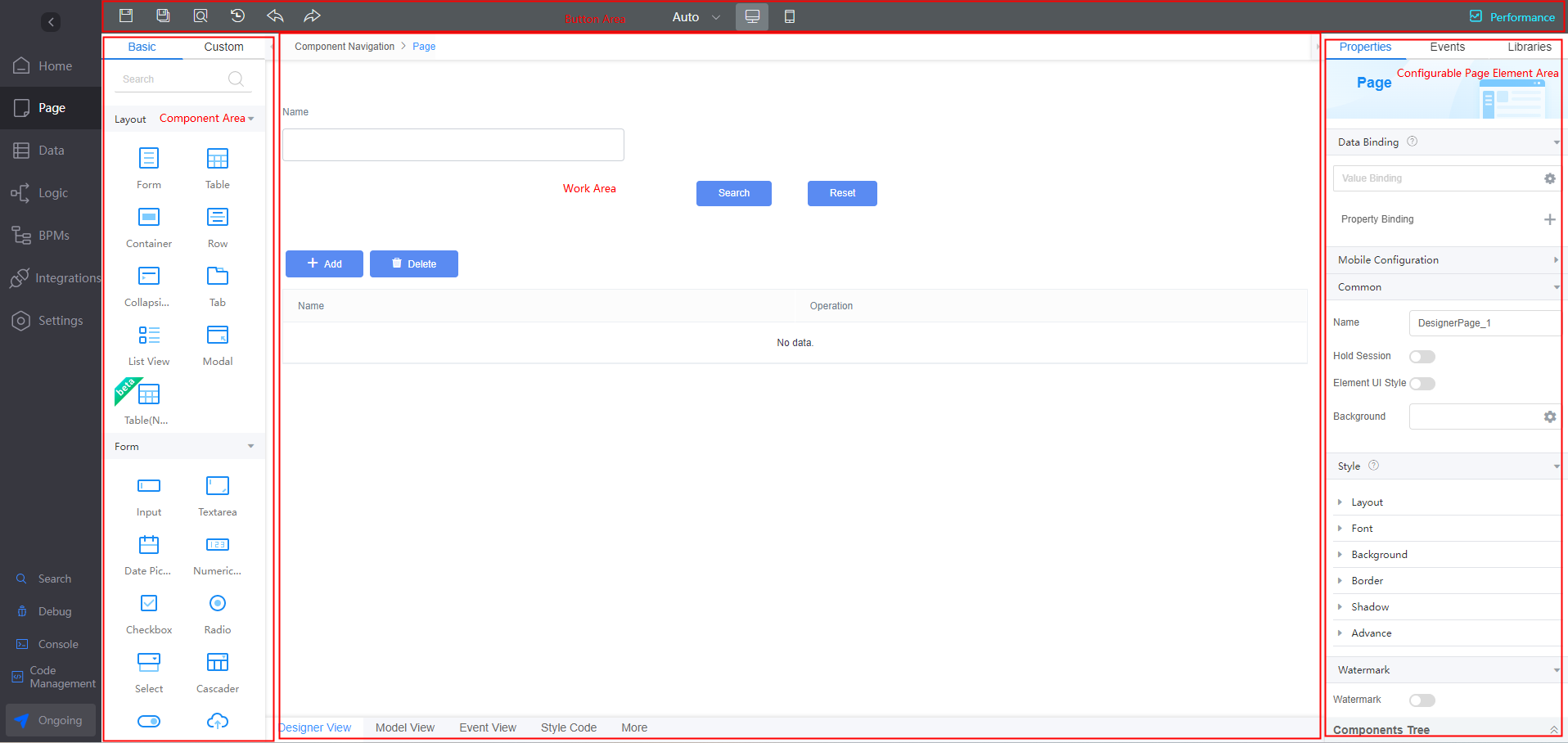
The standard page development layout is divided into four areas: a widget area on the left, a button area at the top, an operation area in the center, and a page element configuration area on the right. For details, see Table 1.
Area | Function |
|---|---|
Button | Area for function buttons used to perform operations such as Save, Save As, Preview, Change History, Undo, Redo, and Performance. |
Widget | Widget area of the page. When you design a page, you need to drag widgets from this area to the page to implement abundant page functions.
|
Work area | Area where you can perform operations such as page layout and widget positioning.
|
Configurable page element area | Area for setting page and widget properties. In this area, you can set widget properties and events, or load third-party libraries.
|
Common Operations on Standard Pages
Before designing a standard page, you need to have a comprehensive understanding of the development page.
- Access the application designer and choose Page. Click the plus sign (+) next to Standard Page. On the displayed dialog box, specify the page label and name and click Add to create a standard page. (On the displayed dialog box, you can choose Create from scratch or Create from template.)
- Multiple widgets are preset on the standard page. You can drag these widgets from the widget area on the left to the design view in the middle. Figure 2 Dragging widgets to the design view

- Before configuring a widget, you can move the cursor to each widget and click
 in the upper right corner of the widget to view the widget details. For details about how to use and configure preset widgets, see Setting Properties of Standard Page Widgets. Figure 3 Help icon of the widgets
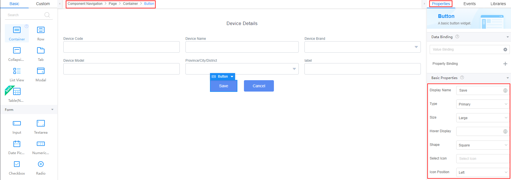
- In Design View, select a widget. On the Properties tab page on the right, set the properties such as the bound data and widget style, as shown in Figure 4.
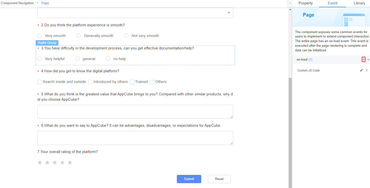
- In Designer View, select a widget. On the Events tab page on the right, set the associated events of the widget. For example, you can select a button widget and add the corresponding event code to on-click of the button widget to save the GUI input to the database after the button is clicked.
- Use the widget navigation to quickly select a widget.
When a widget is selected, the system displays its HTML label level in the widget navigation. You can also click a label level to quickly switch widgets. For example, click Page in the widget navigation to select the outermost page widget on the page. As shown in Figure 5.
- Use the widget tree to quickly select a widget.
You can click Components Tree in the lower right corner of the page to expand the widget tree. In the widget tree, you can click a label level to quickly select or switch widgets.
Figure 6 Using the widget tree to quickly select a widget
Differences Between Standard Pages and Advanced Pages
- The standard page offers basic flow and flexible layouts, while the advanced page includes flow and absolute layouts, suitable for scenarios requiring more personalized layouts.
- The standard page features simple widgets, whereas the advanced page offers sophisticated ones, including water drop and line charts.
- In the sandbox and runtime environments, standard pages do not support anonymous access, while advanced pages support anonymous access.
For details about advanced pages, see Advanced Page Overview.
Feedback
Was this page helpful?
Provide feedbackThank you very much for your feedback. We will continue working to improve the documentation.See the reply and handling status in My Cloud VOC.
For any further questions, feel free to contact us through the chatbot.
Chatbot


