Creating Graphs on a Custom Dashboard
Scenarios
In addition to the default dashboards, you can also create one with graphs of the desired type to display metric data. This section describes how to view the outband outgoing traffic rate of multiple ECSs on a custom dashboard. For more information, see Custom Dashboards.
Procedure
|
Procedure |
Description |
|---|---|
|
Ensure that you have required Cloud Eye permissions. |
|
|
Set the dashboard name and enterprise project to create a dashboard. |
|
|
Add graphs on the custom dashboard to monitor cloud services. |
|
|
View the monitoring trend for selected metrics on the dashboard page. |
Preparations
Ensure that you have obtained required Cloud Eye permissions and can create a custom dashboard.
Step 1: Create a Dashboard
- Log in to the management console.
- Choose Service List > Cloud Eye.
- Choose My Dashboards > Custom Dashboards.
- On the My Dashboards page, click Create Dashboard.

- Enter a dashboard name, select an enterprise project, and click OK.
Step 2: Add a Graph
- Log in to the management console.
- Choose Service List > Cloud Eye.
- Choose My Dashboards > Custom Dashboards.
- Locate the dashboard for which you want to add a graph and click its name.
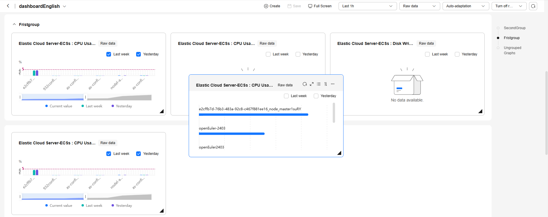
- On the dashboard page, click Create to create a graph or graph group.
- Graph: displays the trend or instantaneous values of selected metrics in different charts.
- Graph group: Similar to a file directory, you can group graphs in a dashboard to different groups.
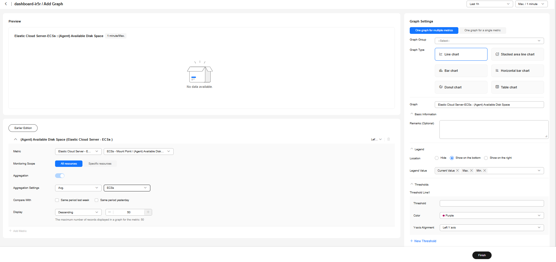
- Click Create Graph and configure graph settings on the right of the page.
- On the Graph Settings page, select One graph for multiple metrics and set Graph Type to Line Chart.
- Set the legend position to Show on the bottom and Legend Value to Current Value, Max., Min., Avg., and Sum.
- Set thresholds and threshold lines.
- Select metrics in the lower part of the page.
- Metric: Select Elastic Cloud Server - ECSs > ECSs / Outband Outgoing Rate.
- Monitoring Scope: Select All resources.
- Aggregation Settings: Select Avg. > ECSs.
- Display: Select Descending and enter 50.

- Click Finish. After the graph is created, you can drag it to a specified location or group.


Custom Dashboards allows you to create graphs tailored to your O&M scenarios, helping you better manage cloud resources.
Step 3: View Graphs
After adding a graph, you can view monitoring data in the default or custom time ranges.
- Log in to the management console.
- Choose Service List > Cloud Eye.
- Choose My Dashboards > Custom Dashboards.
- Click the name of the dashboard you created and view all graphs on it.
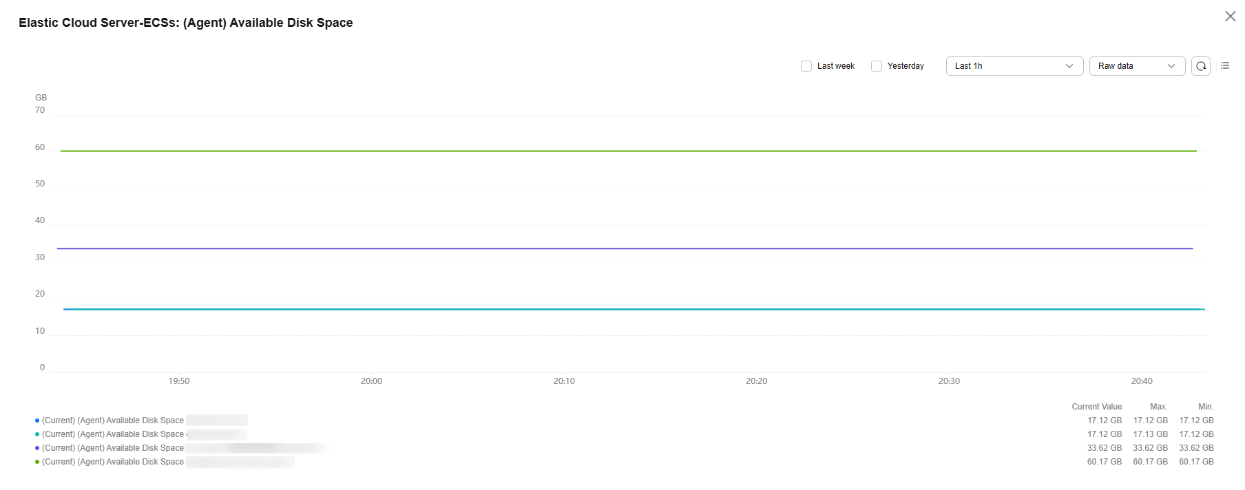
- Hover your mouse over a graph. In the upper right corner, click
 to view monitoring details on an enlarged graph. Select a default time range or customize one to view the metrics.
Figure 1 Viewing metric details
Feedback
Was this page helpful?
Provide feedbackThank you very much for your feedback. We will continue working to improve the documentation.See the reply and handling status in My Cloud VOC.
For any further questions, feel free to contact us through the chatbot.
Chatbot


