Updated on 2025-01-22 GMT+08:00
Text
This section describes parameters of a text component.
Pattern
- Size/Position
- Size: width and height of the component. Unit: pixel.
- Position: position where the component is located in the canvas. Unit: pixel.
Figure 1 Text
- Global Style
- Overflow Scrolling: if you select Overflow Scrolling, the system plays the text in rotation if the text overflows.
- Scrolling Duration: to set the text scrolling duration by entering a value or clicking
 . Scrolling Duration is valid only when Overflow Scrolling is selected.
- Text Style
- Font: font of the text.
- Font Size: font size of the text.
- Text Spacing: spacing of the content in the text.
- Color: font color of the text.
- Font Width: font width of the text component.
- Alignment: alignment mode of the text. The value can be Align center, Left, or Right.
- Row Height: to adjust the spacing between lines in the text by entering a value or dragging
 .
. - First Line Indent: to adjust the first line indent of the text by entering a value or dragging
 .
.
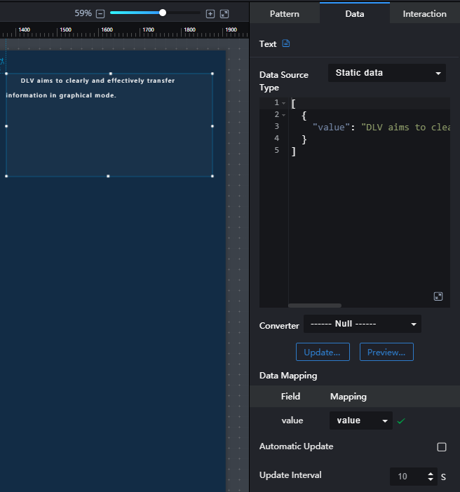
Data

- value: text displayed on the screen.
- Data Source Type: to select the data source of the chart. Multiple data sources are provided for you to select. You need to add data sources first. For details, see Data Connection Overview.
- Converter: Select a converter to convert data into the data that meets the display requirements. For details, see Using a Converter.
- Automatic Update: If you select Automatic Update and set Update Interval, the data is automatically updated based on the interval.
- Preview Result: Click Preview Result to view the information about the selected data source. You can click Update Query to manually update the component data when the data source changes.
Interaction
For details about whether the component supports the interaction function and how to use the interaction function, see Configuring Component Interaction.
Parent topic: Text
Feedback
Was this page helpful?
Provide feedbackThank you very much for your feedback. We will continue working to improve the documentation.See the reply and handling status in My Cloud VOC.
The system is busy. Please try again later.
For any further questions, feel free to contact us through the chatbot.
Chatbot


