Help Center/
Data Lake Insight/
Best Practices/
Data Analysis/
Interconnecting Yonghong BI with DLI to Submit Spark Jobs/
Creating a Chart in Yonghong BI
Updated on 2024-04-29 GMT+08:00
Creating a Chart in Yonghong BI
Scenario
Create a chart in the Yonghong SaaS production environment.
Procedure
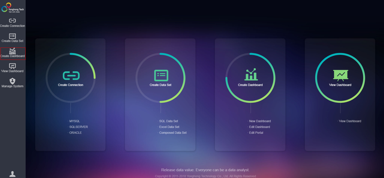
- On the home page of the Yonghong SaaS production environment, click Create Dashboard in the left navigation tree. See Figure 1.
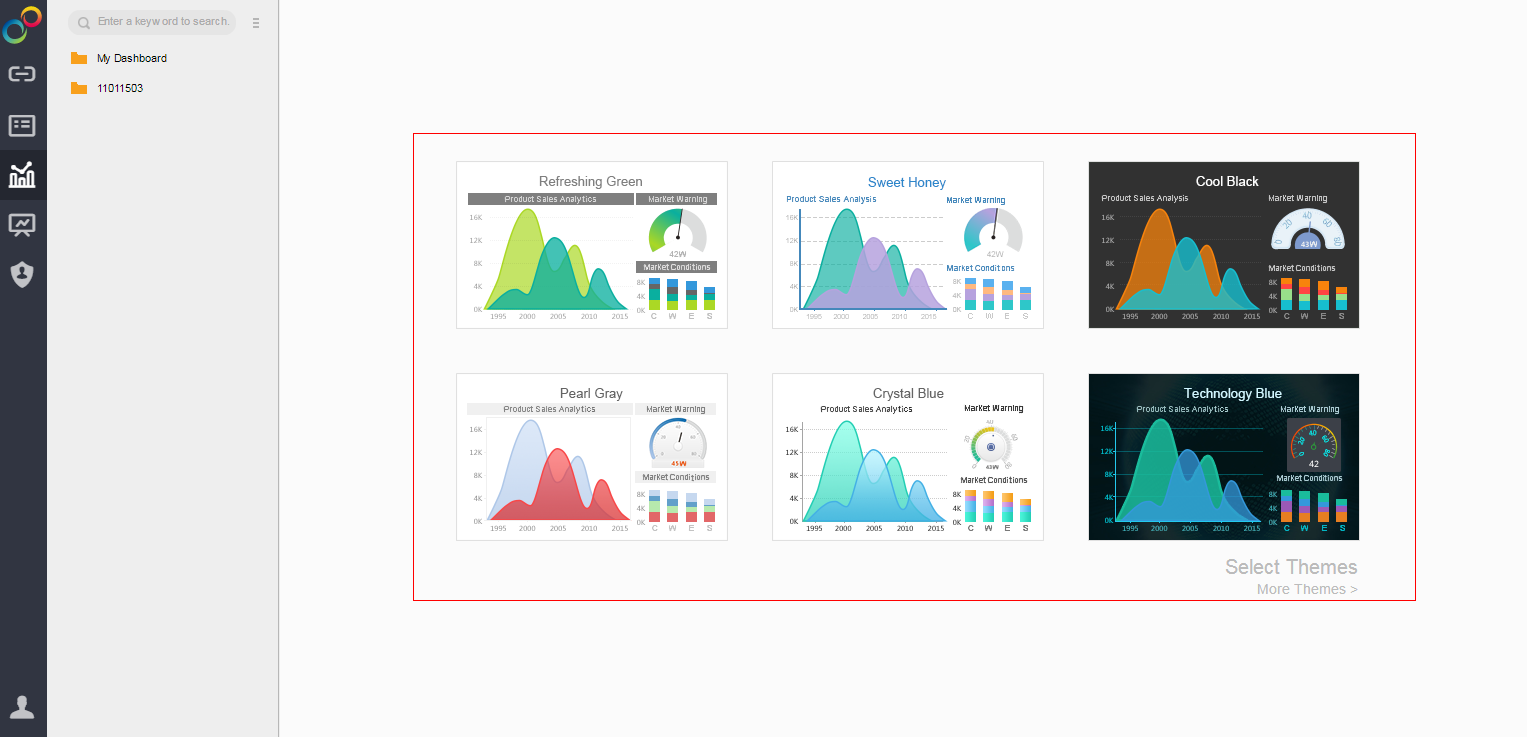
- Select a theme. See Figure 2.
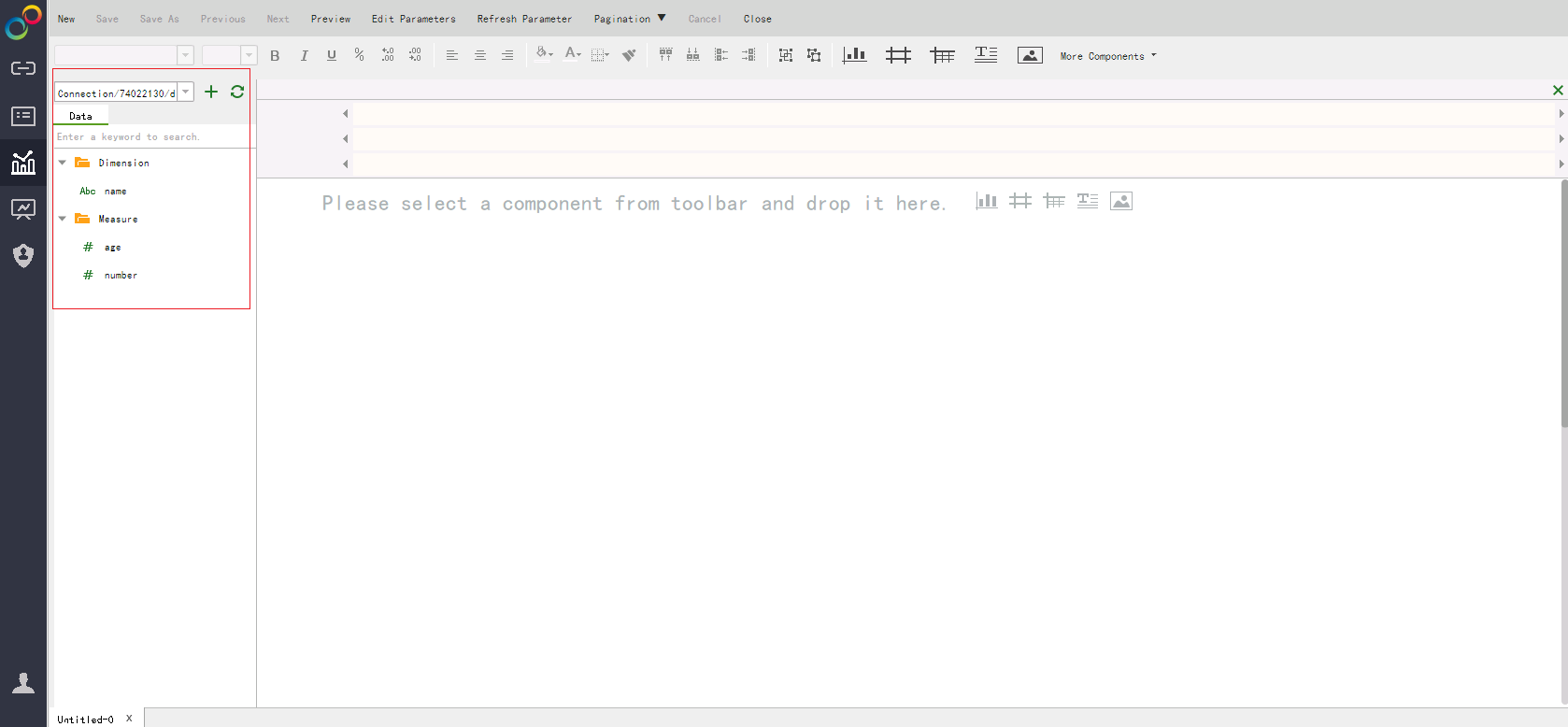
- In this example, the Refreshing Green theme is selected. On the left pane, select the created data set from the drop-down list box and choose a table as the data source (for example, table_child). Metadata (including fields and field types) of the table is displayed in the lower part of the Data column. See Figure 3.
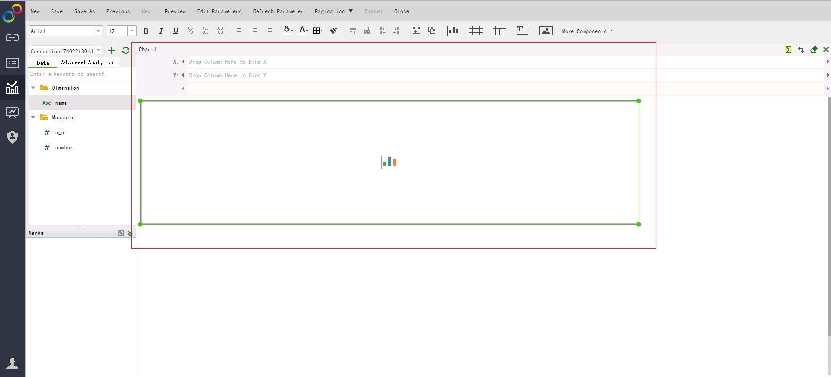
- On the report creation page, chart, table, matrix, and list filtering components are available. For example, if you want to create a chart, click
 and drag it to the editing area. See Figure 4.
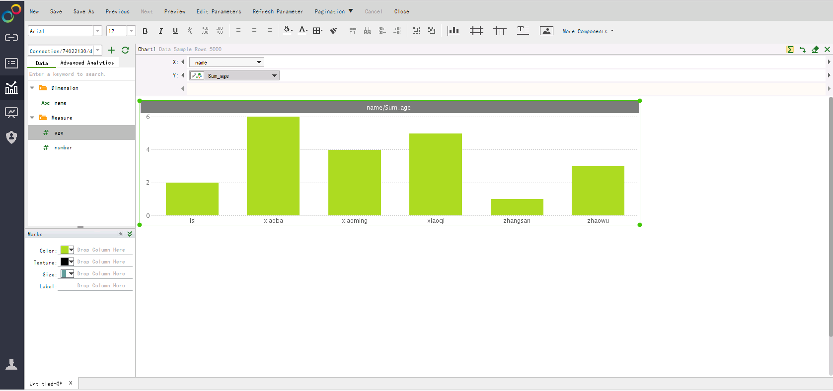
- In X, choose name. In Y, choose age. Drag them to the corresponding area, and the system automatically generates a bar chart. See Figure 5.
- On the tool bar of the displayed page, click Save.
Feedback
Was this page helpful?
Provide feedbackThank you very much for your feedback. We will continue working to improve the documentation.See the reply and handling status in My Cloud VOC.
The system is busy. Please try again later.
For any further questions, feel free to contact us through the chatbot.
Chatbot

