Timeline
This section describes parameters of a timeline component.
Pattern
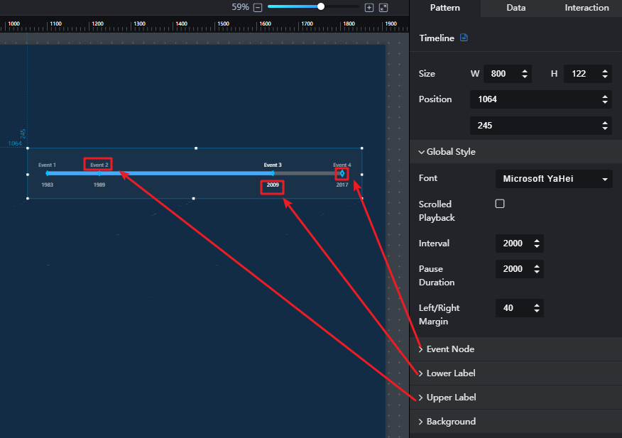
- Size/Position
- Size: width and height of the component. Unit: pixel.
- Position: position where the component is located in the canvas. Unit: pixel.
Figure 1 Timeline
- Global Style
- Font: font type of the component text.
- Scrolled Playback: when Scrolled Playback is selected, the text will be scrolled.
- Interval: to set the interval for scrolling the text by entering a value or clicking
 . Interval is valid only when Scrolled Playback is selected.
 - Pause Duration: to set the play pause duration by entering a value or clicking
 . Pause Duration is valid only when Scrolled Playback is selected.
 - Left/Right Margin: to set the left and right margins of the component by entering a value or clicking
 .
.
- Event Node
- Type: event node type, including Time, Category, and Value.
- Shape: shape of the node, including Rhombus, Circle, Upright triangle, Inverted triangle, Square, and Cross.
- Size: to set the node size by entering a value or clicking
 .
. - Default Style: default style of the node, including Fill Color, Border Color, and Border Width.
- Selected Style: style of the selected node, including Fill Color, Border Color, and Border Width.
- Lower Label
- Offset: offset of the text below the node label.
- Default Style: default style of the text below the node label, including the font size, color, and font width.
- Selected Style: selected style of the text below the node label, including the font size, color, and font width.
- Upper Label
- Offset: offset of the text above the node label.
- Default Style: default style of the text above the node label, including the font size, color, and font width.
- Selected Style: selected style of the text below the node label, including the font size, color, and font width.
- Background
- Width: to set the width of the background by entering a value or clicking
 .
. - Default Style: to set the default background color by clicking the color editor.
- Selected Style: to set the selected background color by clicking the color editor.
- Width: to set the width of the background by entering a value or clicking
Data

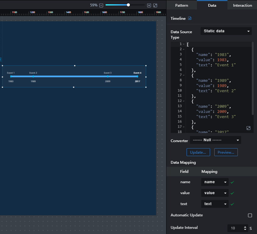
The example data in the preceding figure is as follows:
[
  {
"name": "1983",
    "value": 1983,
"text": " Event 1"
  },
  {
"name": "1989",
    "value": 1989,
"text": " Event 2"
  },
  {
"name": "2009",
    "value": 2009,
"text": " Event 3"
  },
  {
"name": "2017",
    "value": 2017,
"text": " Event 4"
  }
]
- name: text displayed below the time axis node label.
- value: value of the event node.
- text: text displayed above the time axis node label.
Interaction
For details about whether the component supports the interaction function and how to use the interaction function, see Configuring Component Interaction.
Feedback
Was this page helpful?
Provide feedbackThank you very much for your feedback. We will continue working to improve the documentation.See the reply and handling status in My Cloud VOC.
For any further questions, feel free to contact us through the chatbot.
Chatbot


