Full Screen
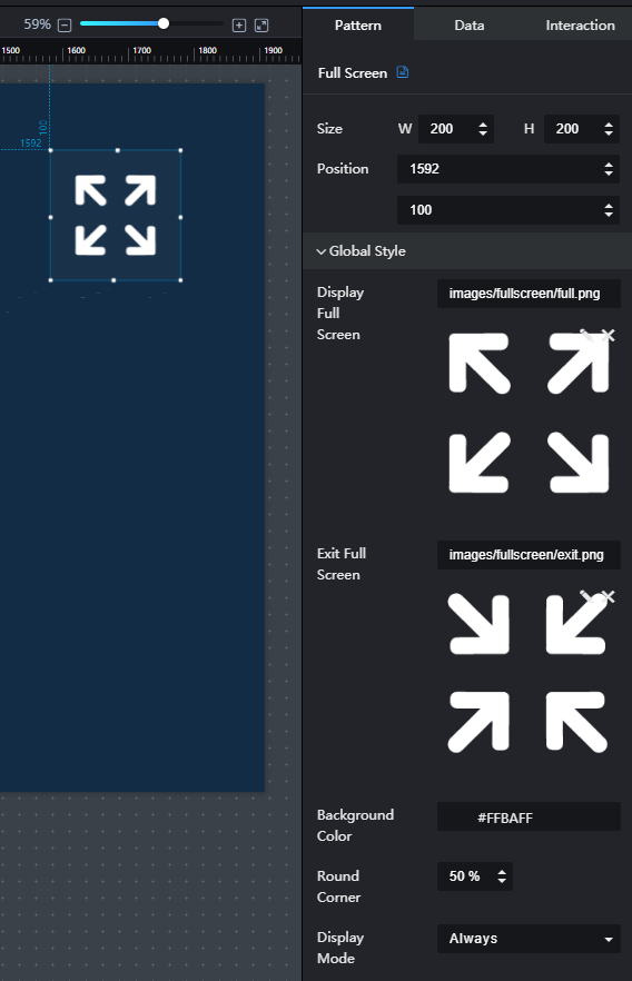
This section describes parameters of a full screen component.
Pattern
- Size/Position
- Size: width and height of the component. Unit: pixel.
- Position: position where the component is located in the canvas. Unit: pixel.
Figure 1 Full screen
- Global Style
- Display Full Screen: full screen display icon that is user-definable.
- Exit Full Screen: full screen exit icon that is user-definable.
- Background Color: background color of the icon.
- Round Corner: shape of the icon background. If the round corner value is 50%, a circle is displayed. If the round value is 0%, a square is displayed.
- Display Mode: mode of displaying or exiting the full screen when you are browsing a screen. The value can be Always or Hover. Always indicates that the button is always displayed on the screen. Hover indicates that the button is hidden by default and is displayed only when you hover over it.
Data
This component does not have data events.
Interaction
For details about whether the component supports the interaction function and how to use the interaction function, see Configuring Component Interaction.
Feedback
Was this page helpful?
Provide feedbackThank you very much for your feedback. We will continue working to improve the documentation.See the reply and handling status in My Cloud VOC.
For any further questions, feel free to contact us through the chatbot.
Chatbot


